Summary
RailBuild designs and manufactures premium rail systems. In a tight three‑week sprint I led a UX overhaul that clarified navigation for three distinct audiences — homeowners, architects, contractors — surfaced specs faster for pros, and turned the Quote Request into a guided next step instead of a dead end.
The problem
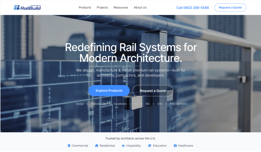
The existing site treated three very different audiences as one. Homeowners hit dense, technical‑first content when they wanted inspiration and plain‑language guidance. Architects had to dig through marketing content to find specs, CAD, and documentation. Contractors ran into unclear CTAs and a Request‑a‑Quote flow that lacked any product context.
The challenge
- Three audiences with fundamentally different goals on the same site — homeowners, architects, contractors.
- Aggressive three‑week timeline with existing CMS, existing content, and limited engineering capacity.
- Premium product positioning that had to come through structure and hierarchy, not heavier visuals.
- Stakeholder review cadence with Marketing kept in the loop on content and brand alignment.
My role
I led the UX direction end‑to‑end: rebuilt the IA and navigation model to support three audience pathways, designed a responsive page‑template system for scannability and scale, structured a Resource Hub so pros could get to specs directly, designed a contextual Quote entry pattern, and delivered handoff specs covering states, behaviors, and edge cases for the two front‑end developers.
Design decisions
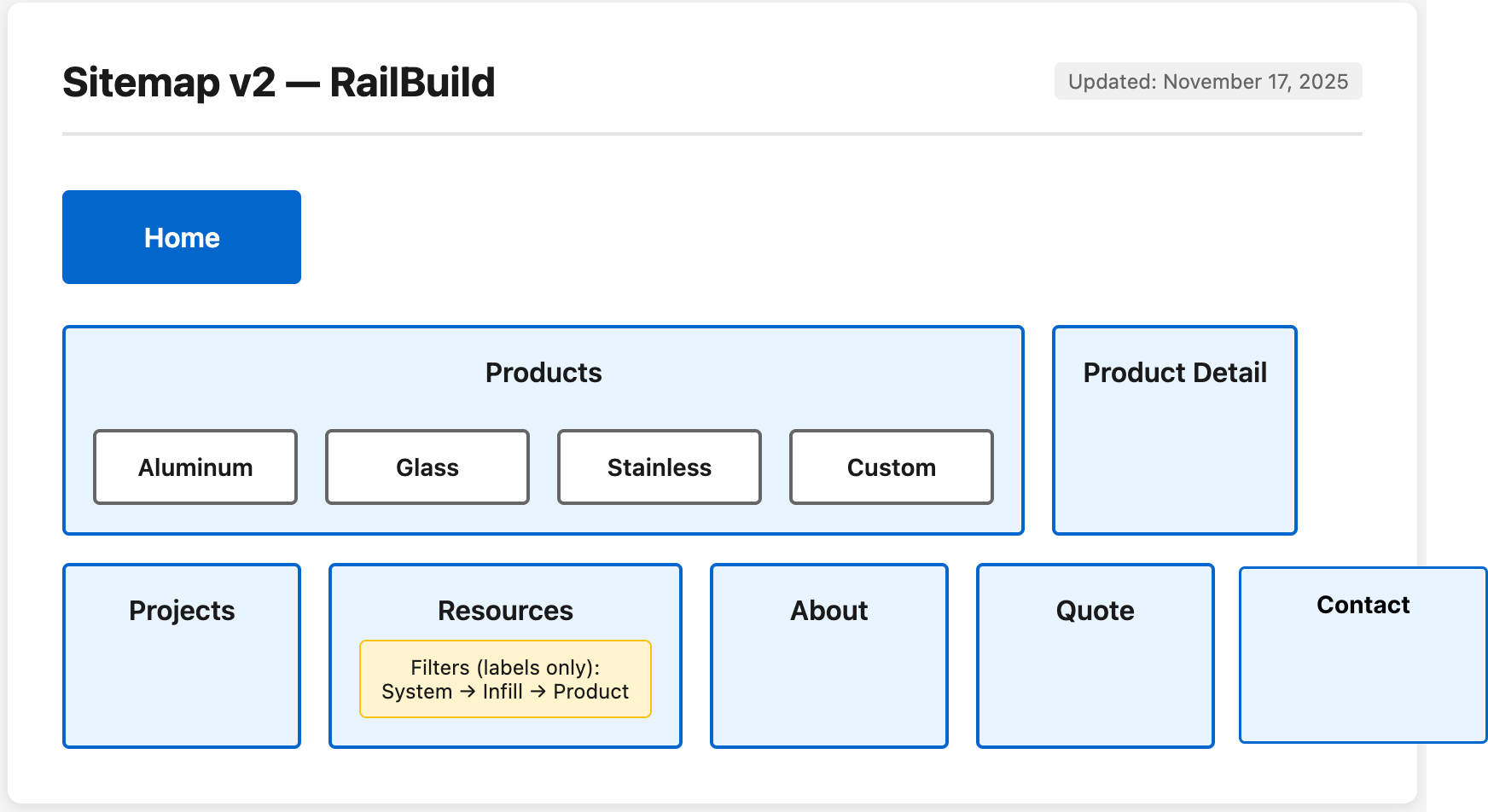
Persona‑based IA with three front doors
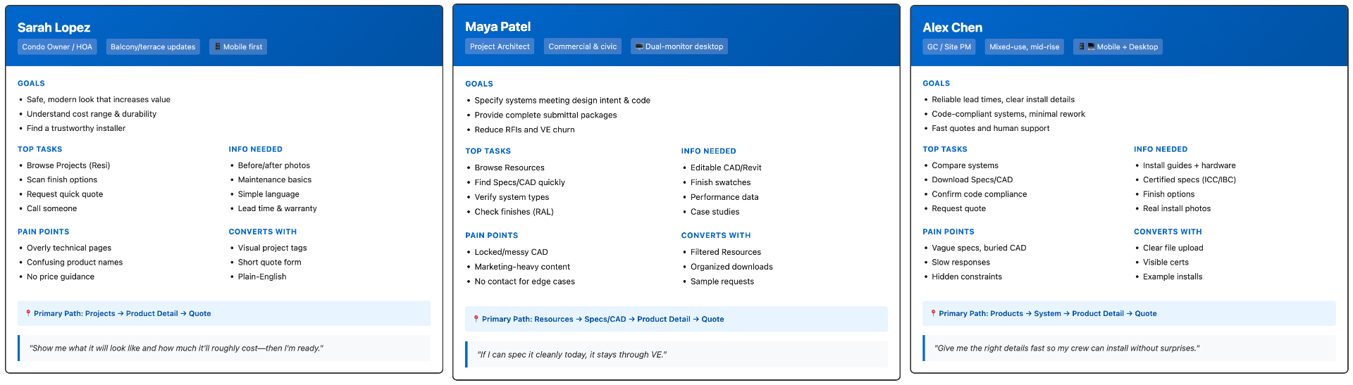
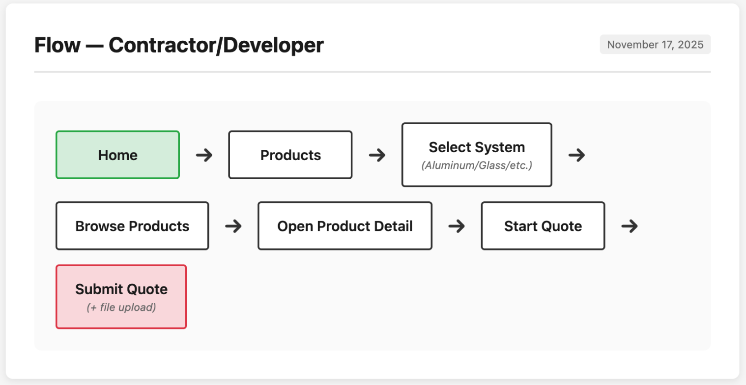
Rebuilt the information architecture so each persona — homeowner, architect, contractor — has a clear entry point and a path that matches how they actually shop, instead of forcing one funnel on everyone.
Product exploration that compares, not guesses
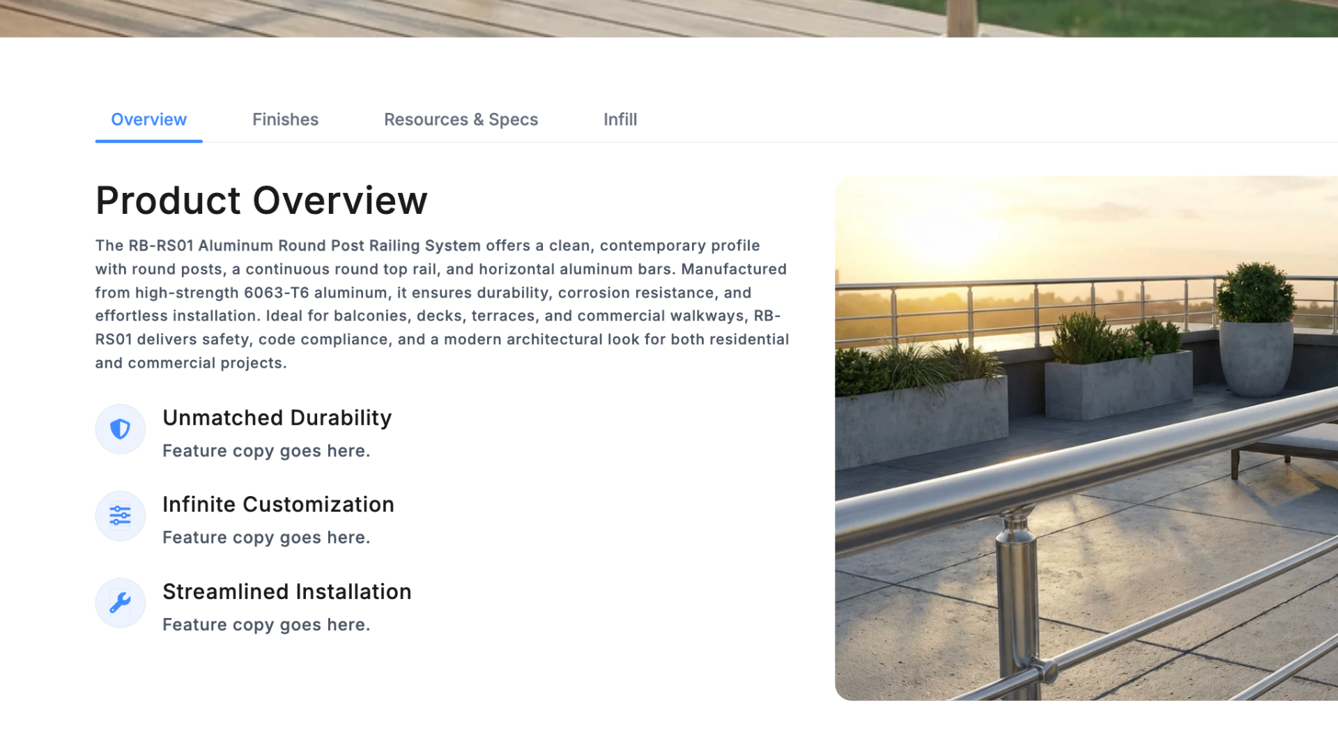
Introduced a more usable product exploration structure — clearer product comparisons, fewer dead ends, and a Product Detail layout that separates what it is, why it matters, what options exist, and what to do next.
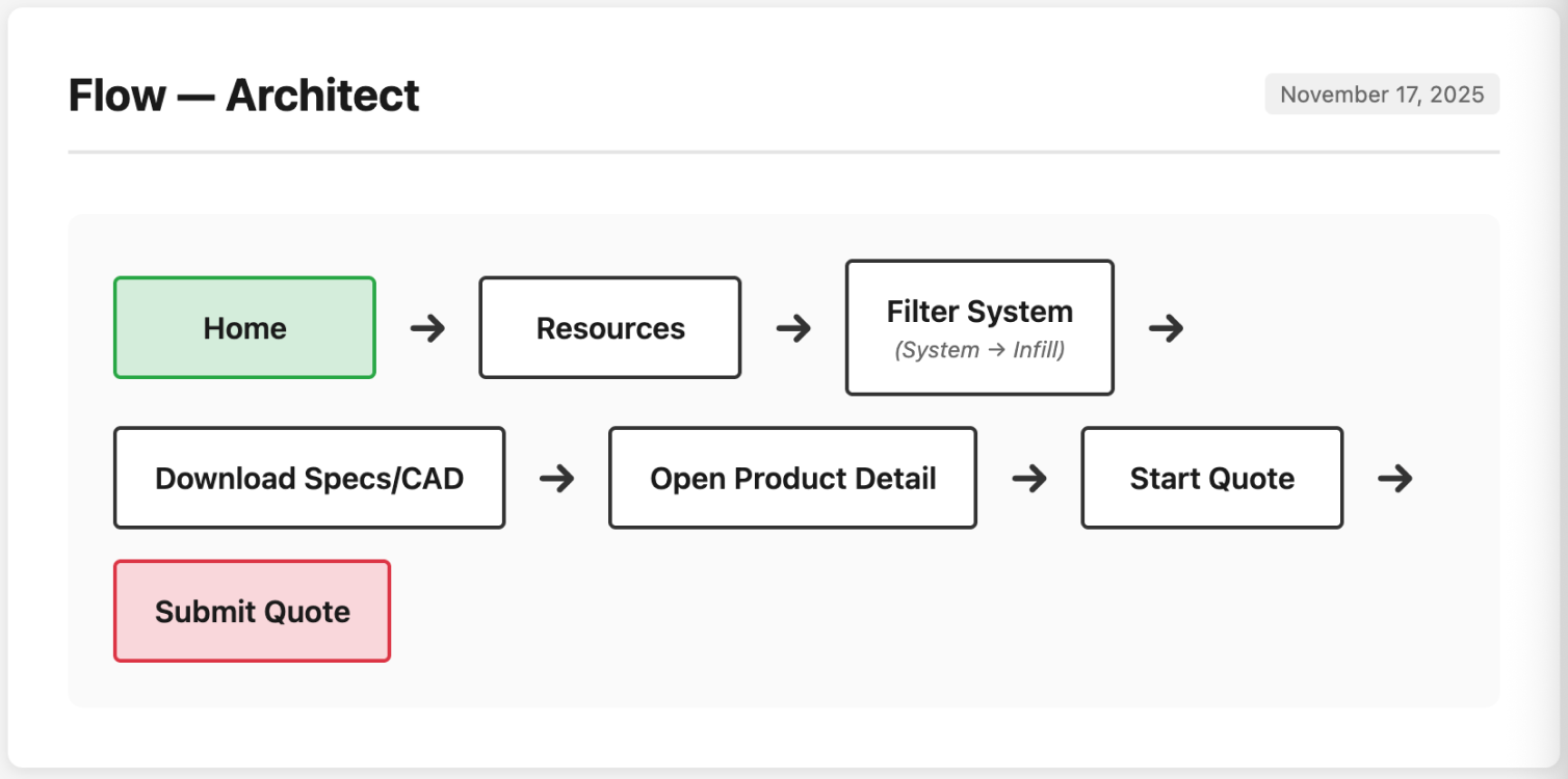
Resource Hub for pros
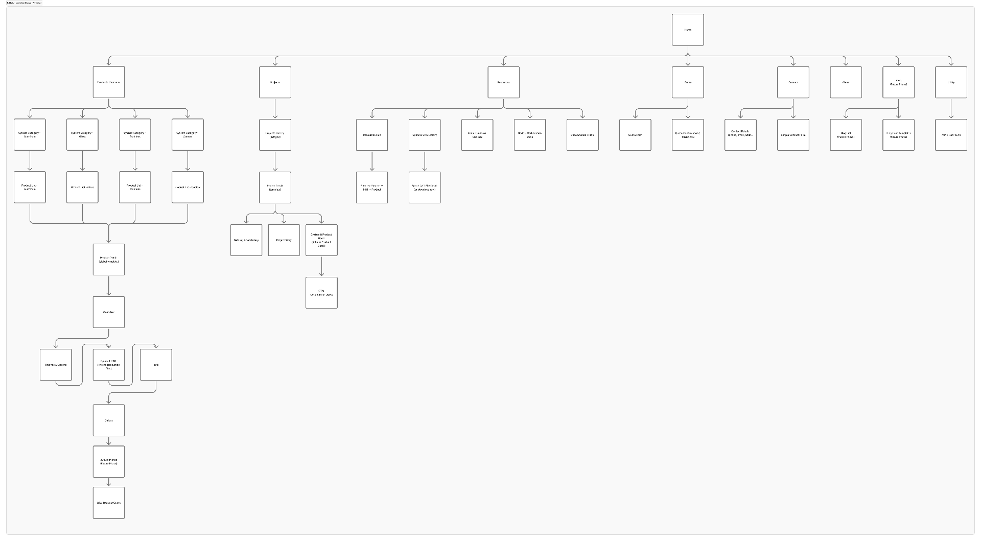
Centralized specs, CAD, and documentation in a Resource Hub so architects and contractors can get to what they need directly, instead of digging through marketing pages written for homeowners.
Contextual Quote Request entry
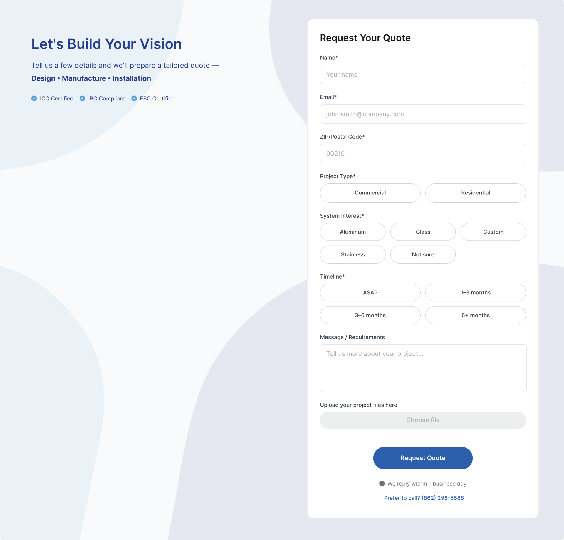
Refined the Quote Request so it lives at the natural next step after product exploration — keeping the form lightweight while carrying enough product context to come in as a qualified lead.
System
Responsive page templates
A small set of page templates — product detail, category, resource, quote — designed for scannability and scale, so new products and content can ship without re‑designing layout each time.
Hierarchy as language
Headings orient, subtext explains, CTAs commit. The same hierarchy rules run across pages so users always understand what to do next at every step of the journey.
Configurator UI pattern
A clearer way to explore finishes and mounting options inside the Product Detail page, so customers compare configurations in context instead of hunting through separate pages.
Interface
Product Detail page
Restructured layout that separates the product itself from its specs, options, and CTAs — giving homeowners enough to feel confident and pros enough to commit.

Configurator UI pattern
A more intuitive way to explore finishes and mounting options without hunting through pages, anchored inside the Product Detail experience.
Quote Request experience
A contextual, low‑friction entry point that feels like the next step after product exploration — keeping the form light while passing product context downstream.
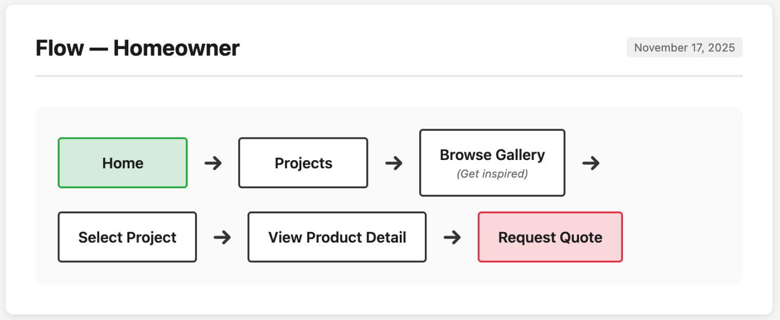
Persona‑driven user flows
Distinct flows for homeowner, architect, and contractor so the site feels guided instead of dense — each path matches how that audience actually decides.
Gallery
Outcome
Pros found technical specs significantly faster, reducing inbound support requests. Standardized templates cut stakeholder back‑and‑forth and sped up Marketing approvals. Quote requests came in more qualified because users had real product context before they hit the form.
Reflection
A three‑week sprint forced clear trade‑offs: instead of one funnel, three honest front doors; instead of one page doing everything, a template system that can scale. The biggest UX lever wasn't visual polish — it was letting each audience self‑select quickly and giving pros a Resource Hub that respected their time.