RailBuild
Streamlining product discovery + quoting for three buyer types
3 Weeks
Lead UX (me), 2 Front-End Developers, Marketing Team (feedback + reviews)
Overview
RailBuild designs and manufactures premium rail systems. The website had to serve three different audiences with very different needs—without overwhelming anyone or hiding critical specs.
In a tight three-week window, I led a UX overhaul that clarified navigation, secured fast access to specs for pros, and created a guided "Quote Request" path that reduced drop-offs.
The Problem
RailBuild's existing site was confusing for its three core user groups — each with fundamentally different goals:
Homeowners
Needed inspiration and plain-language guidance to request a quote confidently — but found dense, technical-first content.
Architects
Needed fast access to specs, CAD details, and documentation — but had to dig through marketing content to find them.
Contractors
Needed product clarity, options, and a straightforward path to pricing — but hit dead ends and unclear CTAs.
Key friction points
Hard-to-find technical docs, competing content (marketing vs. specs), and a "Request a Quote" flow that lacked product context.
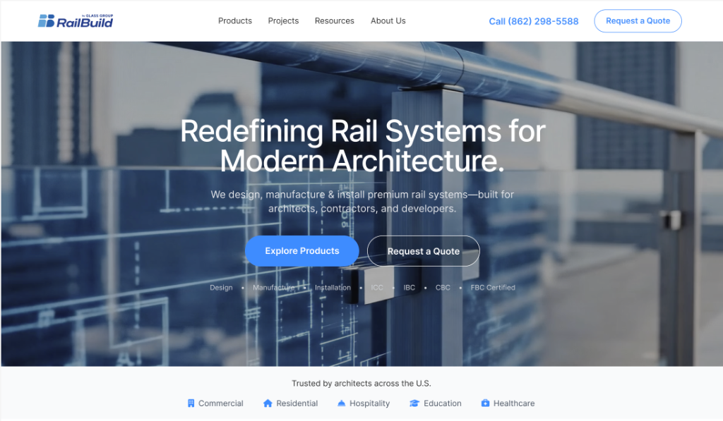
Visual Experience
A cleaner, more modern presentation helped align the digital experience with RailBuild’s premium product quality.
My Role (Senior UX Focus)
I led the UX direction end-to-end:
- IA + Nav Model: Rebuilt structure to support three distinct audience pathways
- Page Template System: Designed responsive templates for scannability and scale
- Resource Hub Structure: Centralized easier access to specs for professionals
- Quote Entry Pattern: Created a contextual, low-friction entry point for leads
- Handoff Specs: Delivered states, behaviors, and edge cases for dev
Process (3-week sprint)
Because timeline was aggressive, I ran a structured sprint approach:
Constraints: 3-week timeline, existing CMS/content, engineering capacity, and stakeholder review cadence.
Audit + Alignment
- • Rapid content/UX audit
- • Stakeholder goal sessions
- • Content + brand alignment reviews (Marketing)
Architecture + Flows
- • Defined top-level IA
- • Persona-based pathways
- • Sticky flow mapping
Design + Handoff
- • Key template design
- • Component patterns
- • Dev feasibility syncs
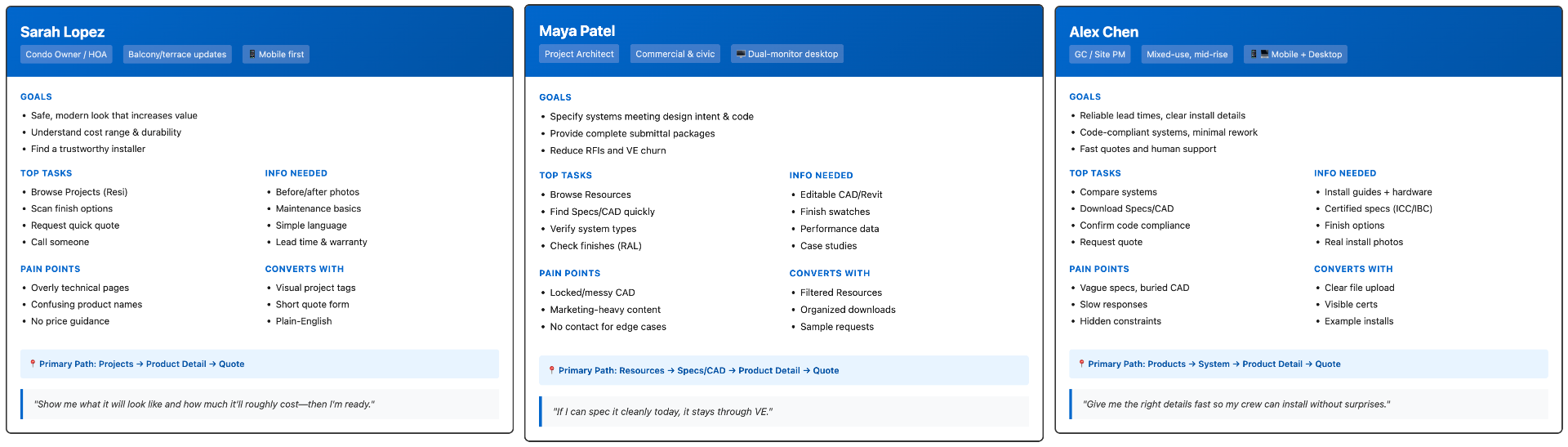
User Personas
We aligned the experience around three clear audiences and what “success” looks like for each one.
Information Architecture & Sitemap
I restructured the IA to reduce ambiguity and help each audience self-select quickly.
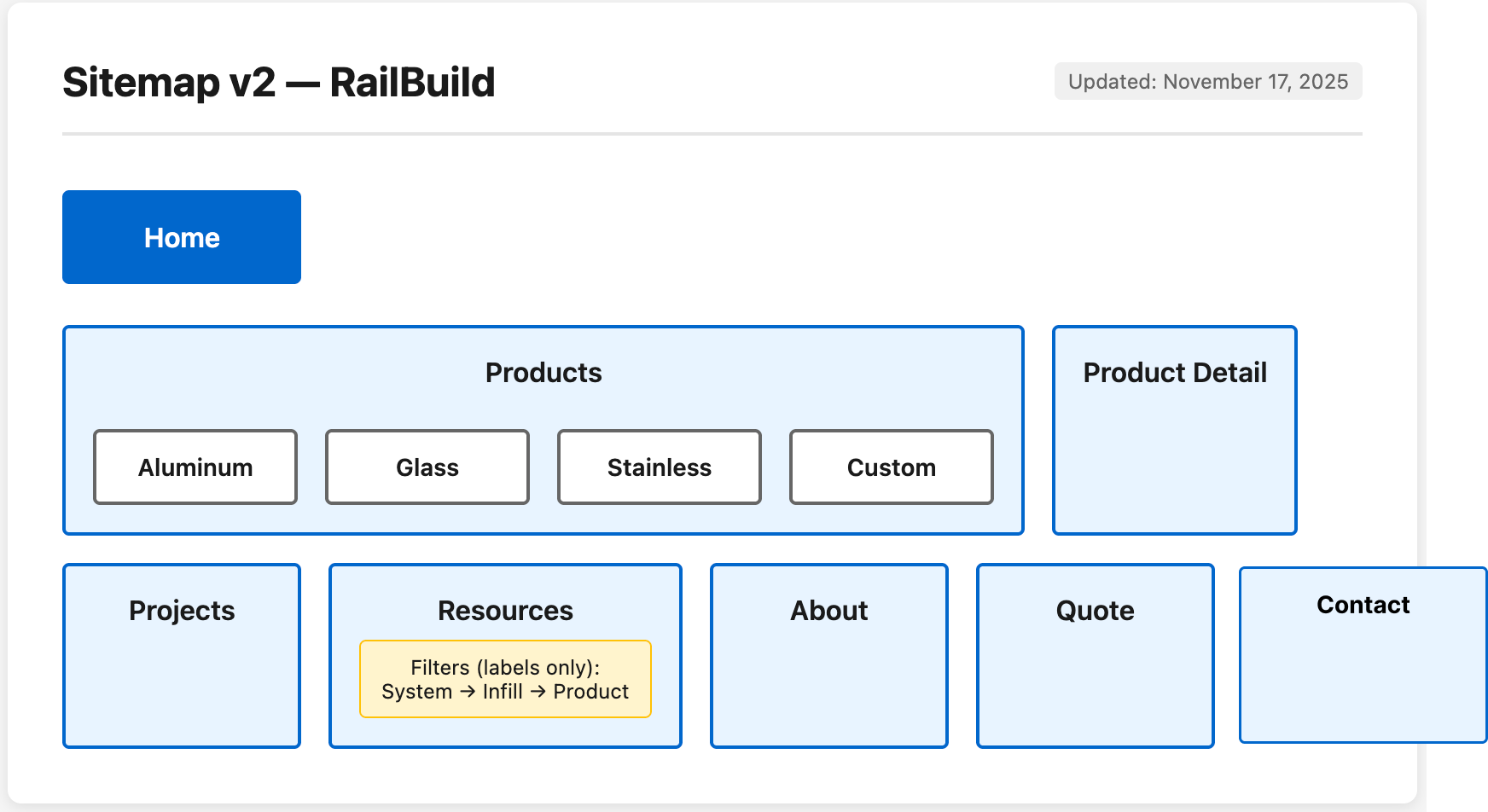
Product Structure
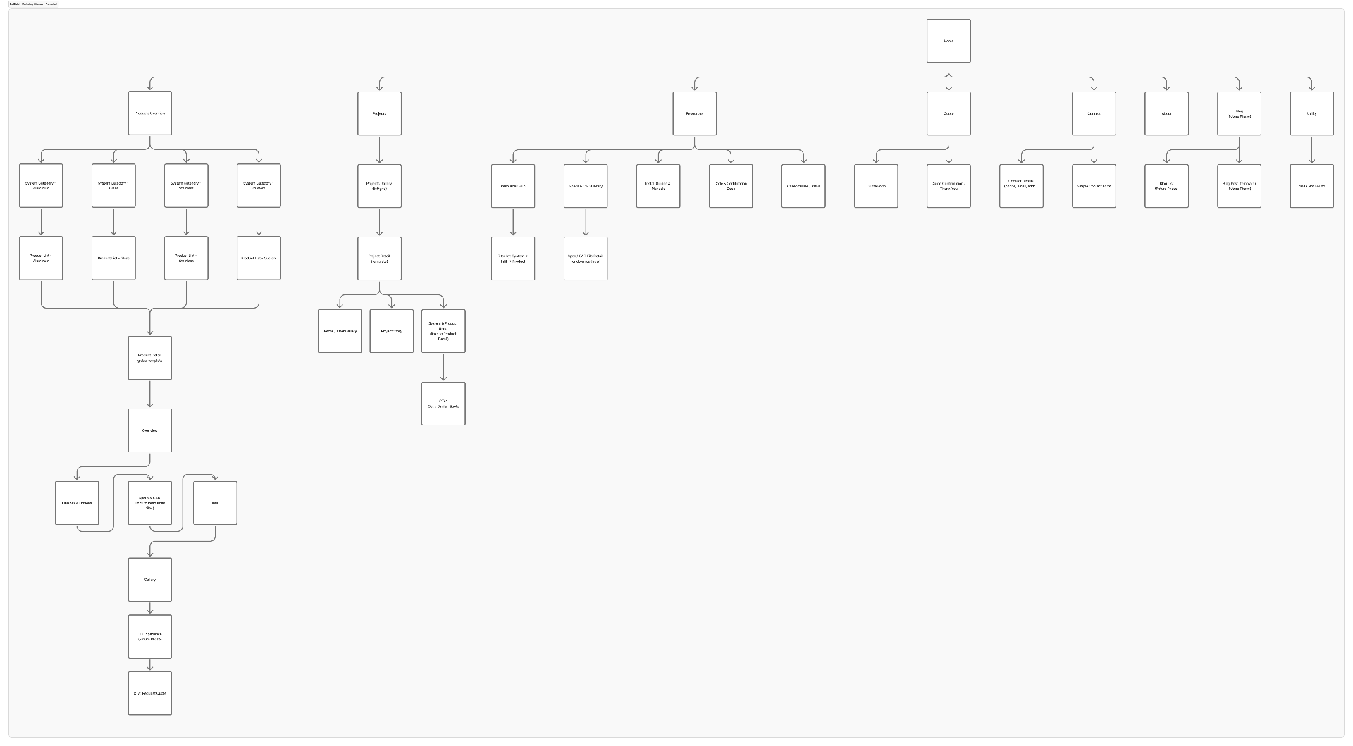
Marketing & Content
User Flows
Clear pathways reduced friction and made the site feel “guided” instead of “dense.”
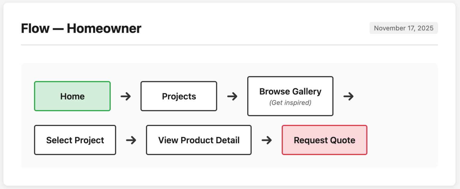
Homeowner Journey
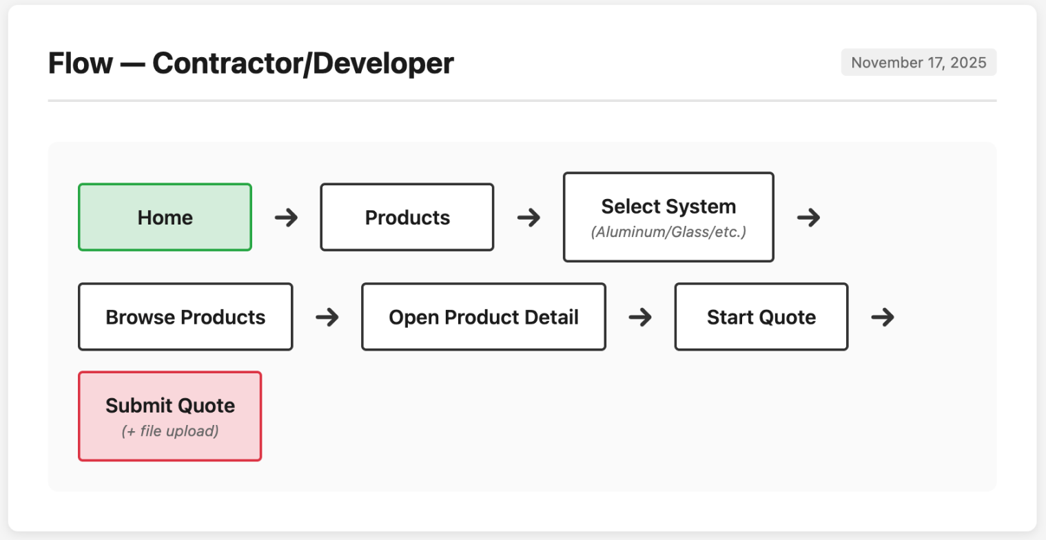
Contractor Journey
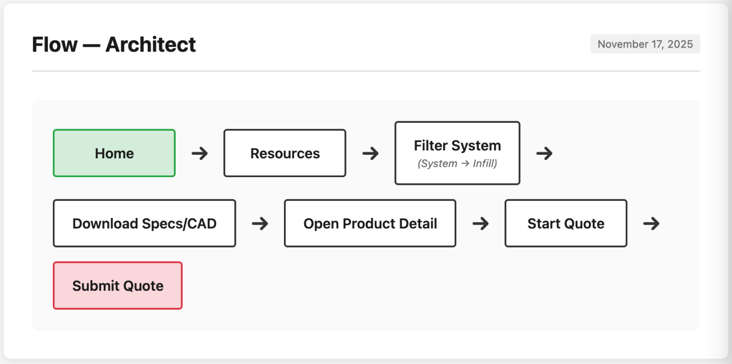
Architect Journey
Visual Design & Key Features
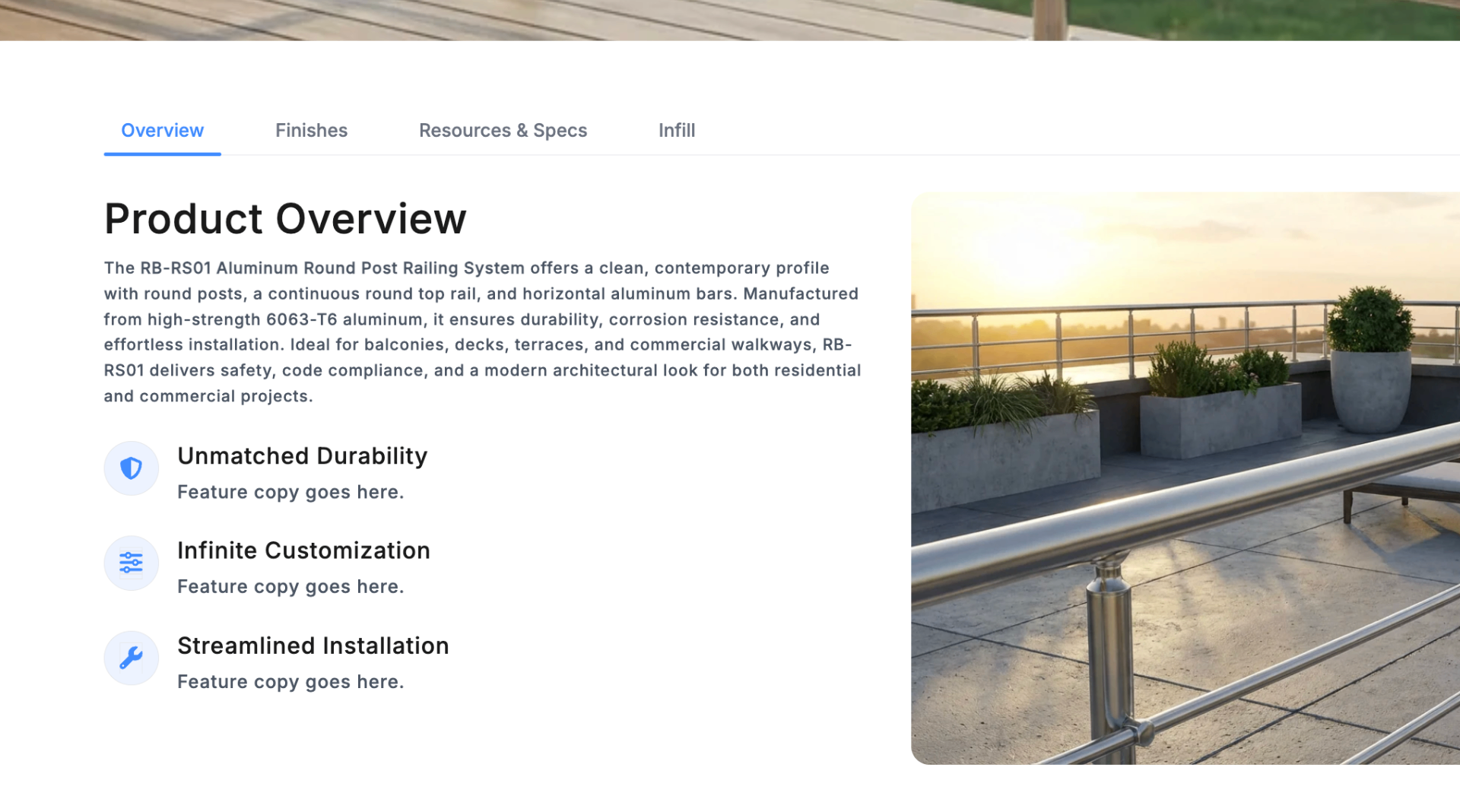
Product Detail Page
A clearer layout that separates: what it is, why it matters, what options exist, and what to do next.
Product Configuration (UI Pattern)
A more intuitive way to explore finishes and mounting options without hunting through pages.

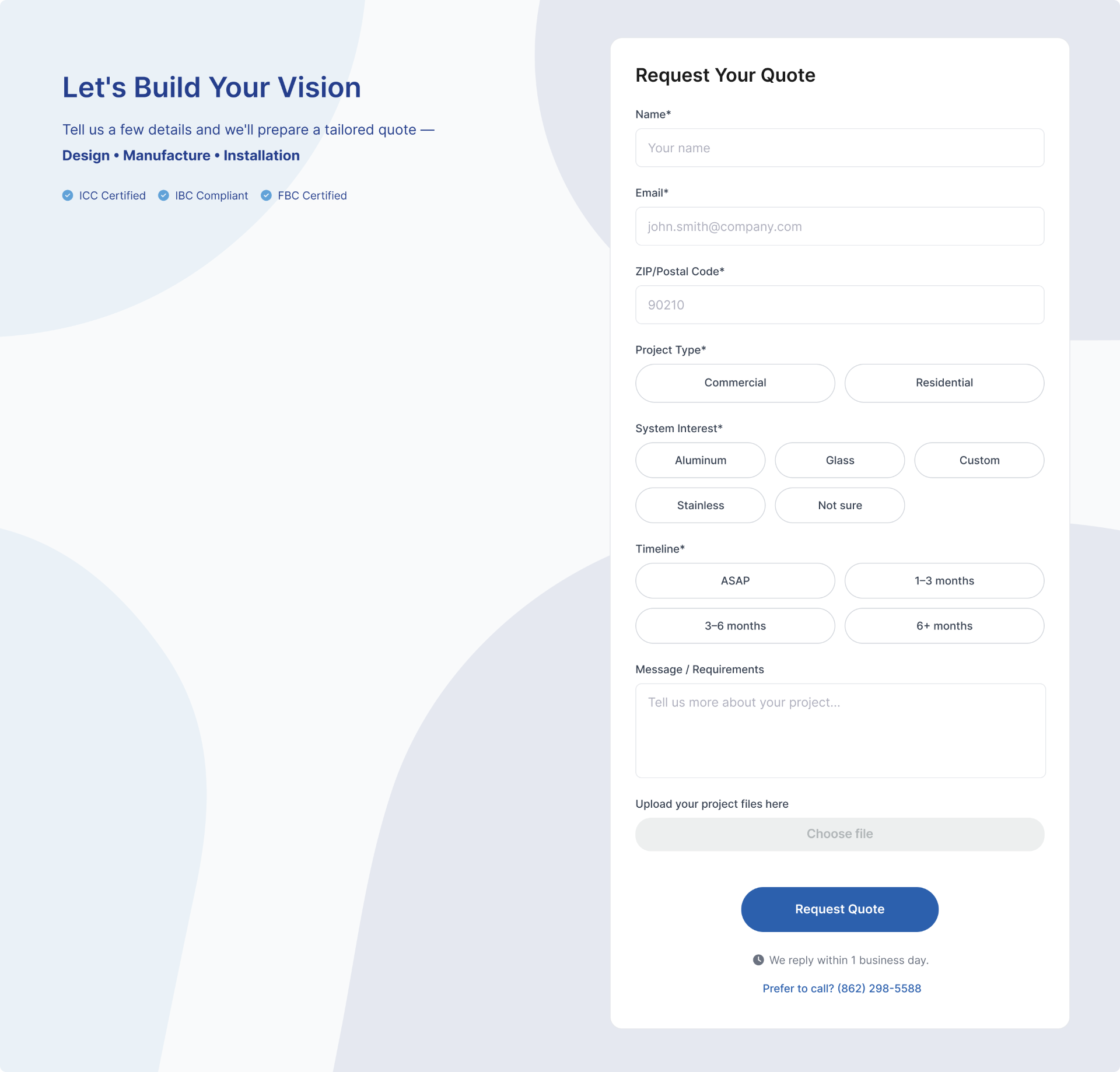
Quote Request Experience
Refined the quote entry point so it feels like the natural next step after product exploration—while keeping the form lightweight.
The Solution
A restructured experience that gives each audience a clear path — from first impression to conversion.
Persona-based IA
Rebuilt the information architecture so each persona — homeowner, architect, contractor — has a clear "front door" into the experience.
Product Exploration
Introduced a more usable product exploration structure — less guessing, fewer dead ends, and clear product comparison.
Resource Hub for Pros
Strengthened the specs and documentation experience — giving architects and contractors direct access without hunting.
Clear Content Hierarchy
Improved content hierarchy and CTAs so users always understand what to do next at every step of the journey.
Outcomes
The updated experience delivered:
- Access Speed: Pros found technical specs significantly faster, reducing support requests
- Process Efficiency: Reduced stakeholder back-and-forth by standardizing templates
- Conversion Context: Quote requests became more qualified due to clearer product options
- Marketing Velocity: Marketing approvals moved faster due to a clearer content structure
Next Project
FidemDD Website Redesign