Summary
Redesigned the FidemDD site to centre the work itself — clear case studies, honest descriptions of the team's approach, and a tone that matches the kind of clients they want.
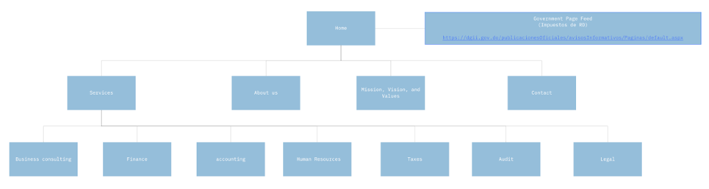
The problem
The previous site read as a brochure. Strong projects were buried under stock language. Inbound leads were unqualified.
The challenge
- Small content team; no dedicated writer for ongoing updates.
- Existing CMS had to stay.
- Bilingual: ES / EN, with parity, not afterthought.
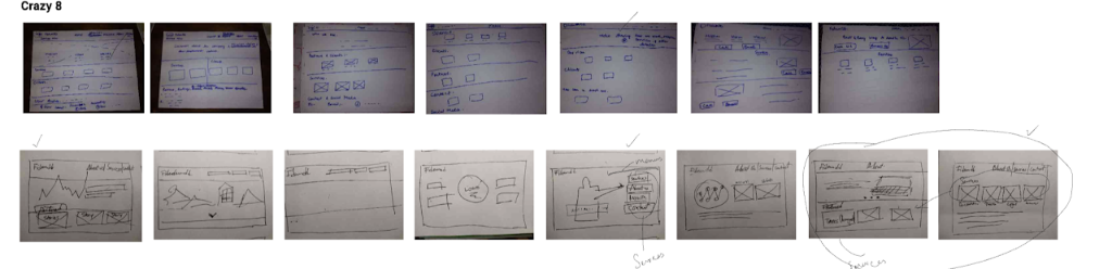
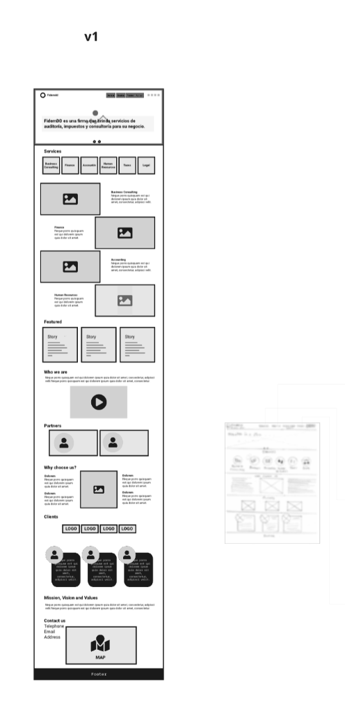
Design decisions
Case studies up front
Home page leads with three projects, each summarised in one honest sentence. No carousel, no hover‑reveal mystery.
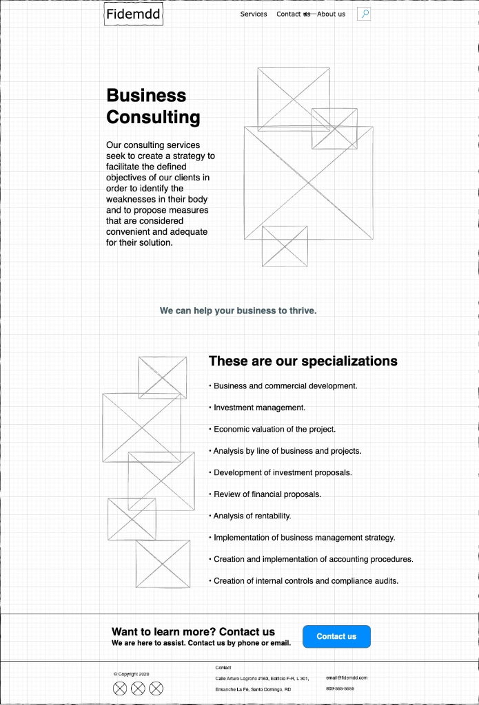
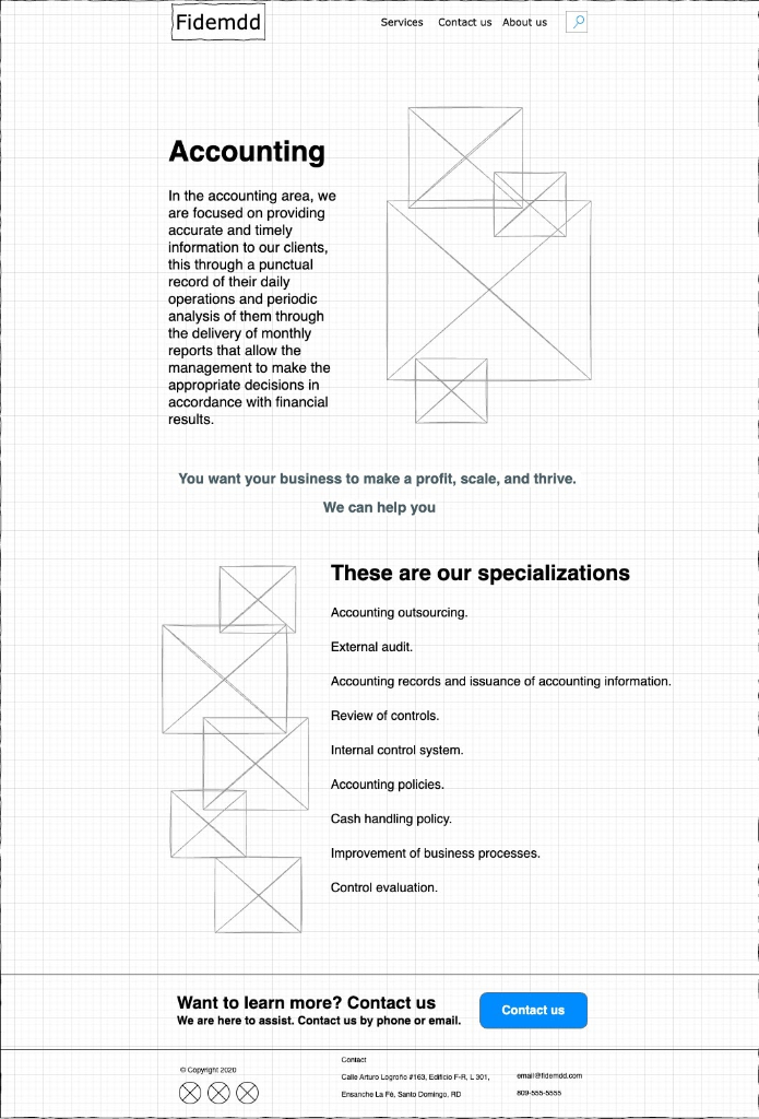
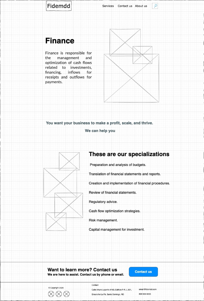
Editorial layout for depth
Long form case studies use a measured editorial grid — wide images, narrow text — so the work breathes.
Inbound that filters itself
Contact form asks for stage, budget range, and scope so the team replies to a real brief, not a 'just exploring'.
System
Type as identity
A serif/sans pair carries the brand; minimal colour, lots of paper.
Component library
A small set of section components the content team can compose without designer hand‑holding.
Bilingual rhythm
Translations sit beside the source in the CMS so updates ship in both languages at once.
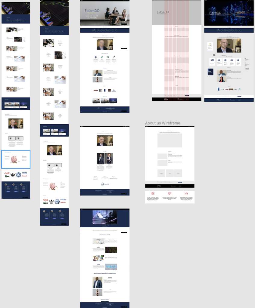
Gallery
Outcome
Higher quality inbound, less time triaging. The team now uses the site itself as a portfolio in pitches.