Summary
Pergolade sells premium outdoor pergola systems with a wide range of options. The existing site didn't feel as premium as the product, and the buying journey let customers get lost in choices before they felt confident. Over an 8‑week engagement I led end‑to‑end UX to restructure the page, redesign the configurator, and connect it to an AR preview on mobile.
The problem
Product options — size, finish, add‑ons — were easy to misinterpret without a guided structure. Inspiration, specs, and commerce competed with each other on the same page, creating friction. The configurator also needed to stay clear and usable on mobile, not just shrink down from desktop.
The challenge
- No formal customer research was available; decisions came from stakeholder sessions, a UX + content audit, and a competitive scan of premium DTC patterns.
- Small team — one designer, one developer, owner as stakeholder — on an 8‑week timeline.
- Mobile parity was a first‑class requirement, not a later adaptation.
- Premium positioning had to come through structure and hierarchy, not heavier visuals.
My role
End‑to‑end UX and UI: information architecture, flows, responsive UI patterns, component specs, and developer handoff. I worked directly with the owner in weekly working sessions and paired each design iteration with feasibility checks from the developer.
Design decisions
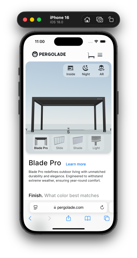
Reorder the page around how a buyer decides
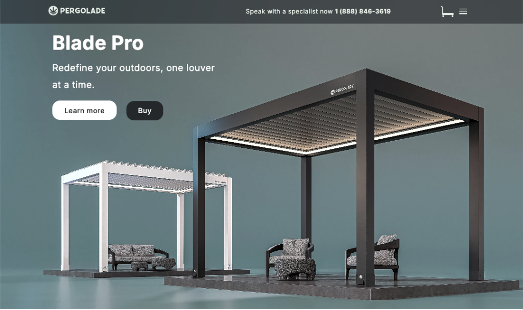
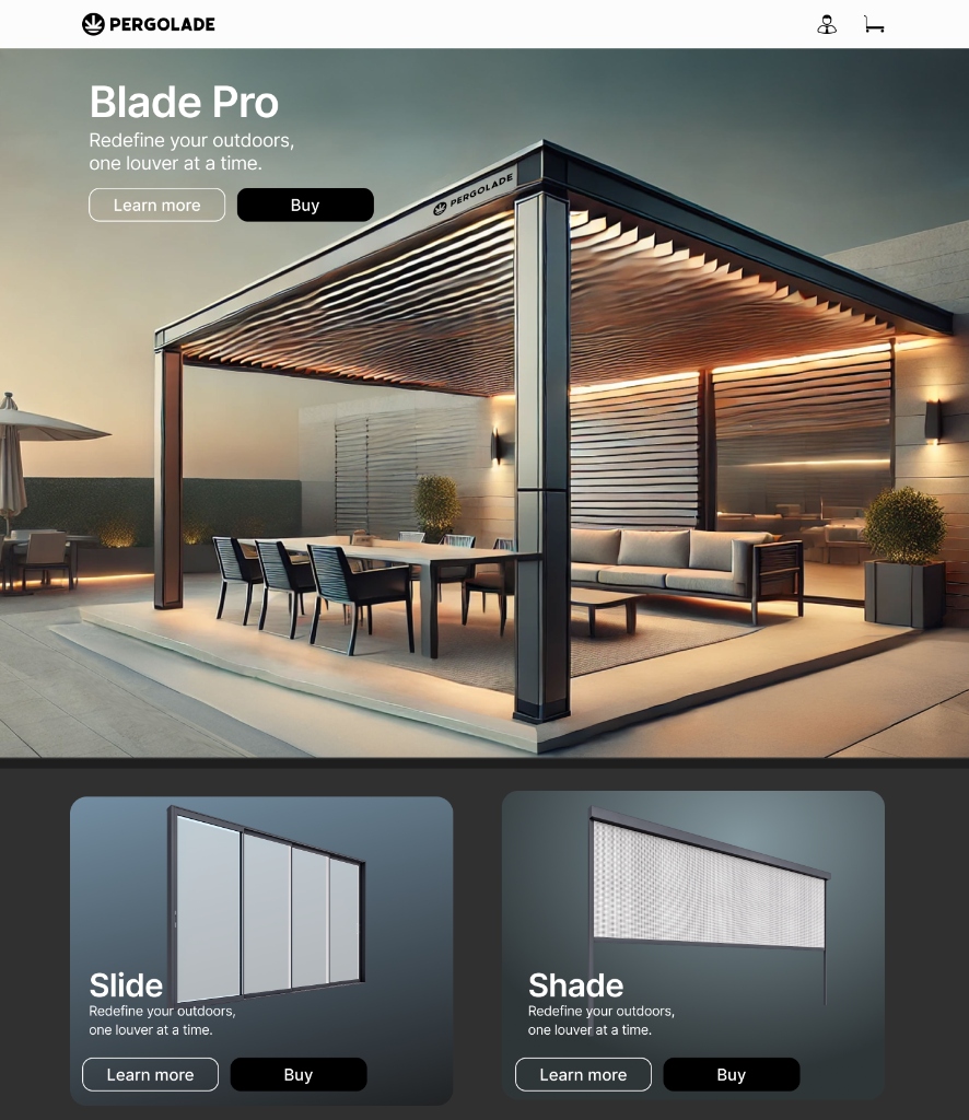
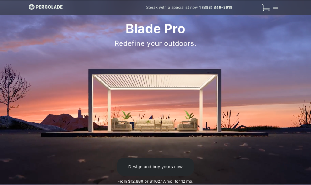
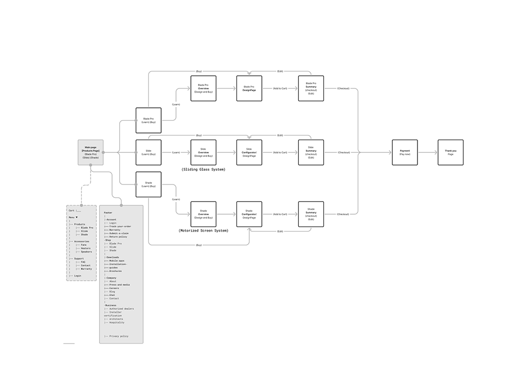
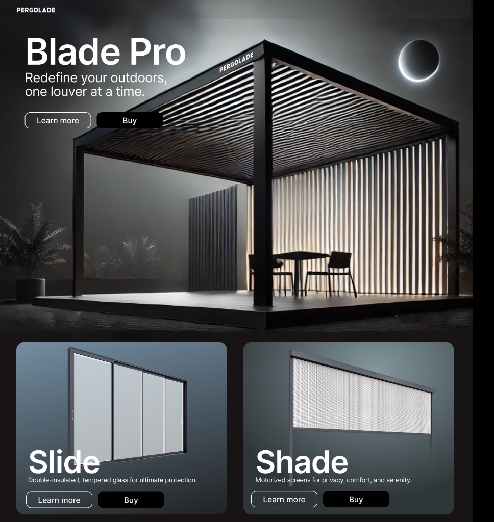
Restructured the page into a sequence that matches buyer intent — Inspiration → What it is → Key benefits → Configure → Proof / Details → CTA — so inspiration, explanation, and configuration stop competing for the same attention.
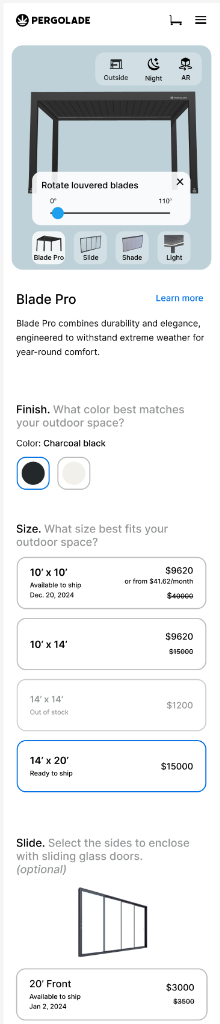
Clear decision steps in the configurator
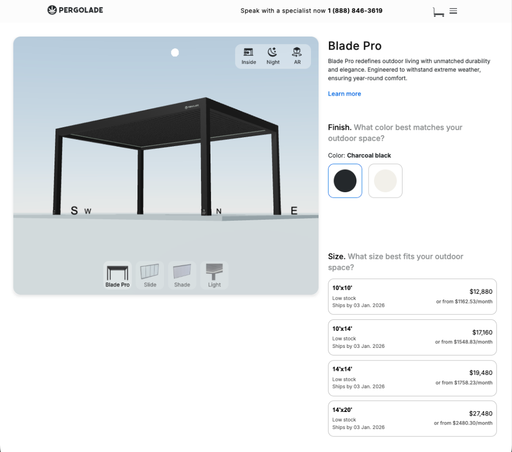
Broke the configurator into ordered decisions — finish, size, add‑ons — with immediate visual feedback so customers understand the impact of each choice as they make it, instead of reconciling everything at the end.
Mobile designed natively, not shrunk
Treated mobile as its own layout: comfortable targets, smart input formatting, and one clear decision per view, so the configurator stays usable in‑hand rather than feeling like a compressed desktop UI.
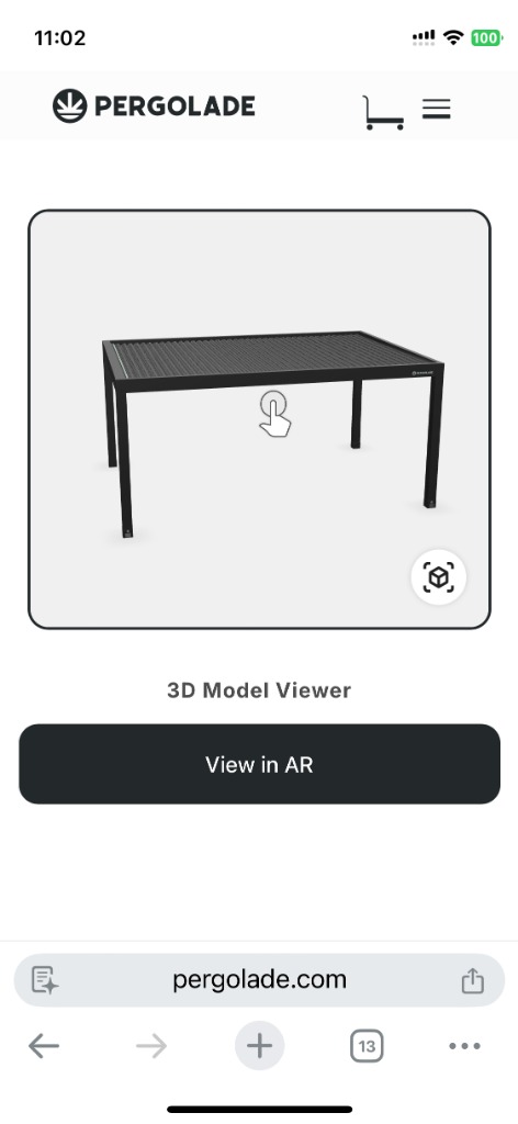
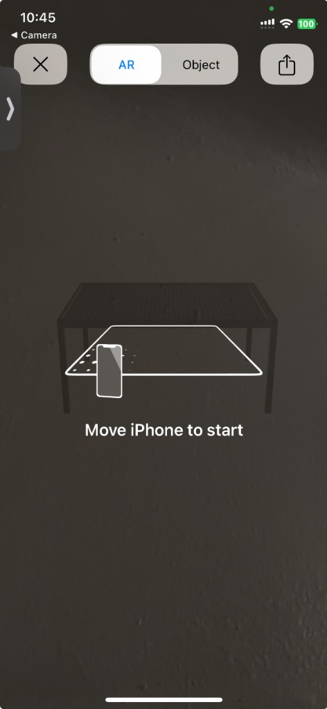
Bridge digital and physical with AR
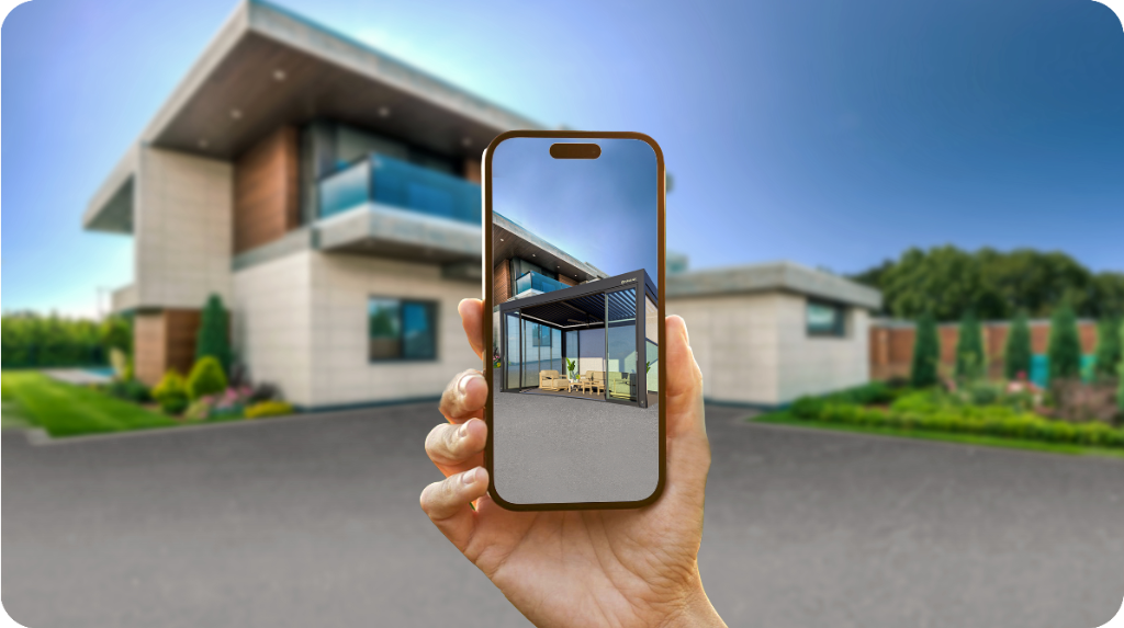
Added a desktop → mobile AR handoff: a dynamic QR code carries the exact configuration to the phone, where the customer can place the pergola in their backyard to confirm size, colors, and shadows before buying.
System
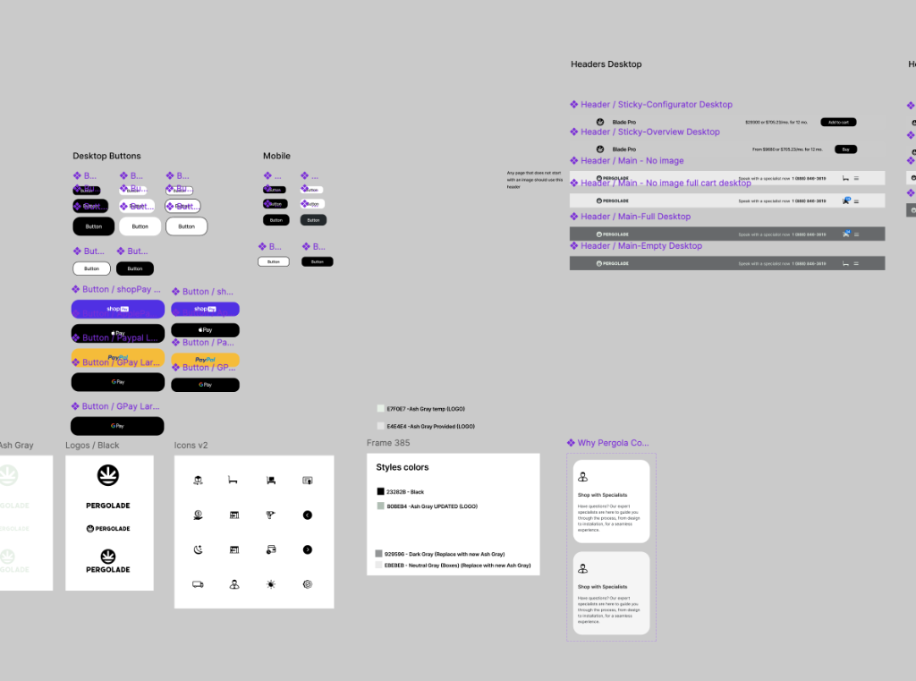
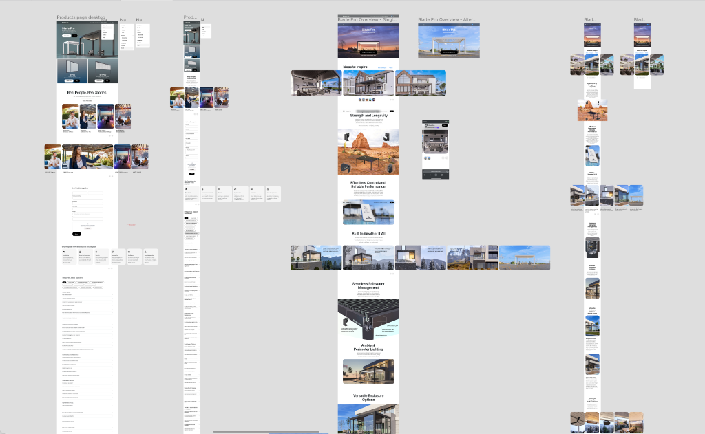
Repeatable section components
A small set of section components — hero, benefits, configurator, proof — so the page reads consistently and the same system can extend to future products.
Hierarchy as language
Headings orient, subtext explains, UI guides. The same hierarchy rules apply across desktop and mobile so the product feels like one experience at any size.
Handoff for a one‑developer team
Component specs, behavior notes, and responsive rules written close to the build, so feasibility checks happened inside the design loop instead of after it.
Interface
Desktop configurator
A calm, spacious layout where the product render anchors the screen and decisions sit beside it. Spacing, grouping, and progressive detail reduce cognitive load without hiding options.
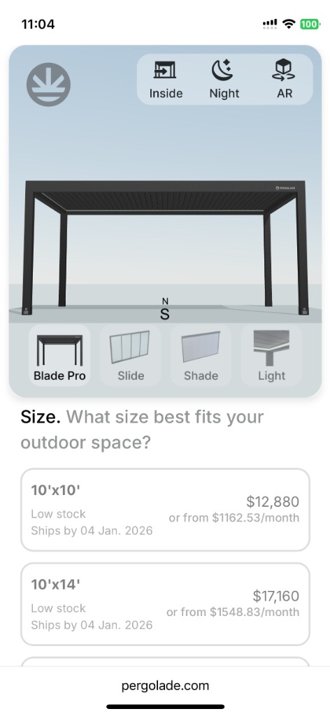
Mobile configurator
Finish, size, and add‑ons each get a clear decision point on mobile, with smart input formatting so the flow feels considered rather than retrofitted.
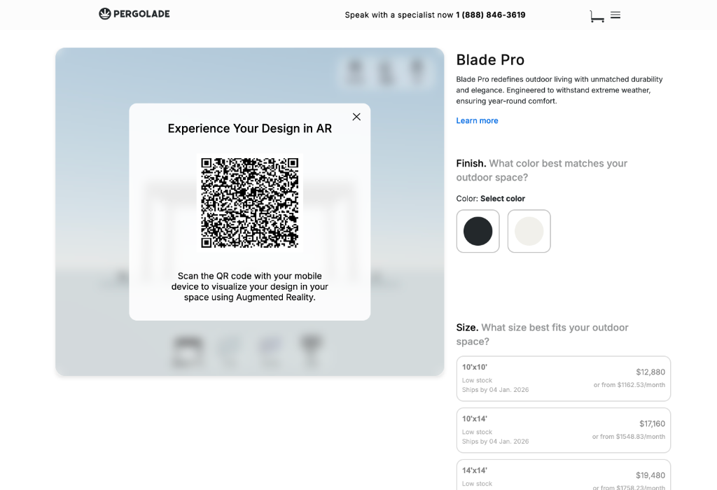
AR handoff
Scan to switch, one‑tap launch, calibrate the space, visualize live. The same configuration travels from desktop to phone to backyard without re‑entry.
Visual exploration
Explored a moodier, cinematic direction and a more architectural, nature‑led direction before converging on a layout that communicates value quickly and supports decision‑making.
Gallery
Outcome
Qualitative: a more premium‑feeling page structure that guides users through decisions, clearer configuration steps that reduce guessing, a mobile configurator that holds up in‑hand, and a section + component system that can be reused for future products. No quantitative metrics were instrumented during the engagement.
Reflection
Even without formal research or analytics, a senior designer can move a complex buying journey forward by sequencing decisions the way customers actually make them, treating mobile as a first‑class surface, and writing handoff close enough to the build that one developer can ship it. The next step I'd take is the missing one: lightweight validation sessions and event instrumentation to turn qualitative confidence into measured behavior.