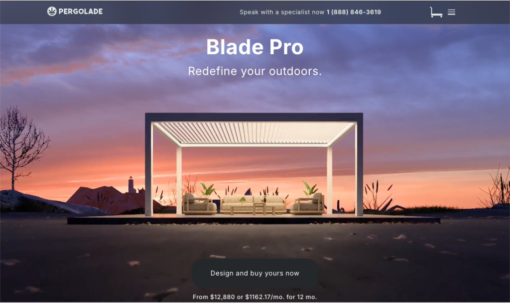
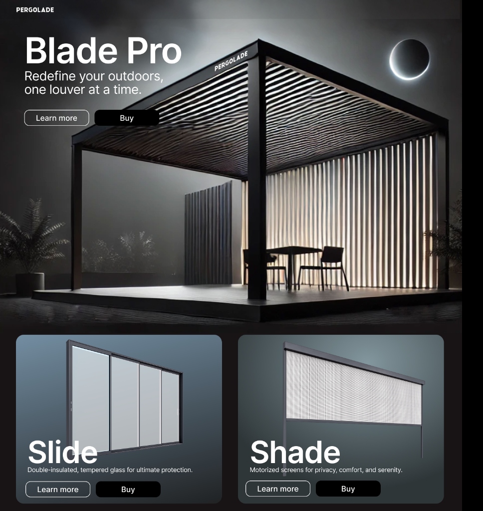
Pergolade Blade Pro
Redefining a premium configurator-led buying journey across desktop + mobile
8 weeks
Me (UX/UI) + 1 Developer + Owner/Stakeholder
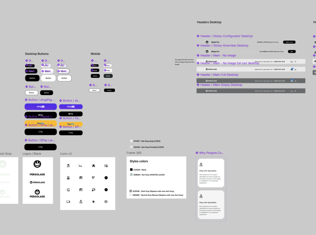
Information architecture + flows, responsive UI patterns, component specs, handoff assets
Context
Pergolade sells premium outdoor pergola systems with lots of customizable options. The existing digital experience didn't feel as premium as the product—and the buying journey made it easy for users to get lost in options before they felt confident.
The Challenge
- Product options (size, finish, add-ons) were easy to misinterpret without a guided structure
- Inspiration, specs, and commerce competed with each other, creating friction
- The configurator needed to stay clear and usable on mobile—not just "shrink down"
Goals
Make the buying journey feel confident, guided, and premium
Help users understand choices as they configure (not after the fact)
Reduce confusion through clearer information hierarchy and section flow
Ensure the configurator is responsive and usable on mobile
Process (pragmatic + execution-driven)
Because formal customer research wasn't available, I focused on a pragmatic, execution-driven approach:
- Stakeholder working sessions (owner-led product knowledge + business priorities)
- UX + content audit of existing sections and the buying flow
- Competitive scan of premium DTC configuration patterns
- Flow mapping to reduce steps, ambiguity, and dead ends
- Rapid iteration with owner feedback + feasibility checks with the developer
Information Architecture
I reorganized the experience to match how a buyer thinks and decides:
Inspiration → What it is → Key benefits → Configure → Proof/Details → CTA
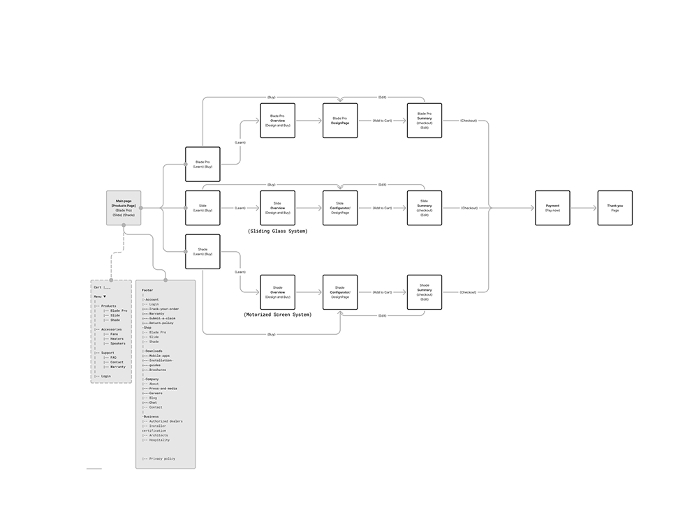
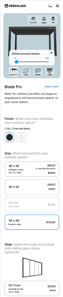
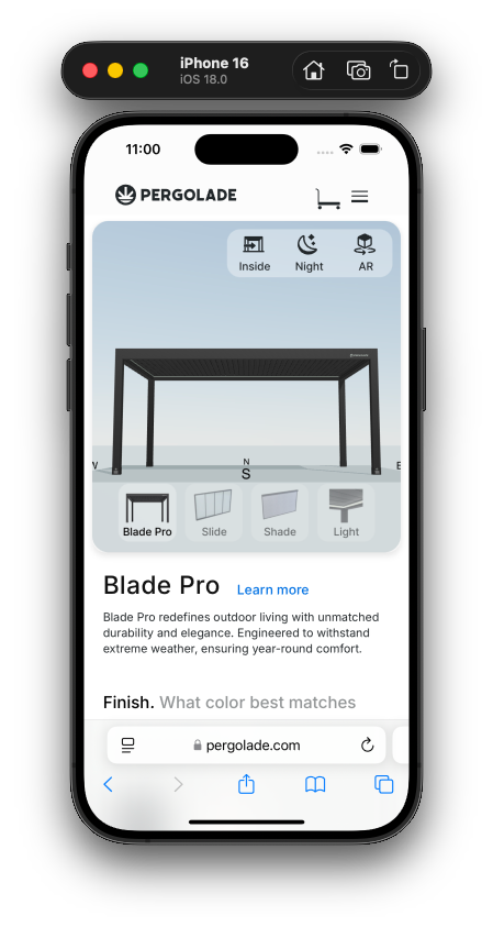
Core UX work: The Digital Configurator
The product is complex, so the UI needed to feel simple. I designed the configurator around:
- Clear decision steps (finish → size → add-ons)
- Immediate feedback so users understand impact as they choose
- Consistency across platforms (desktop clarity, mobile comfort)
- Reduced cognitive load via spacing, grouping, and progressive detail
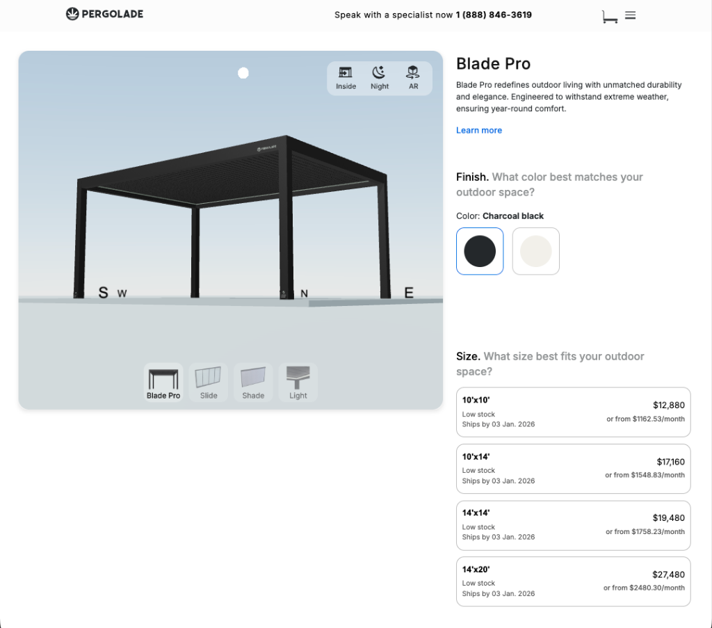
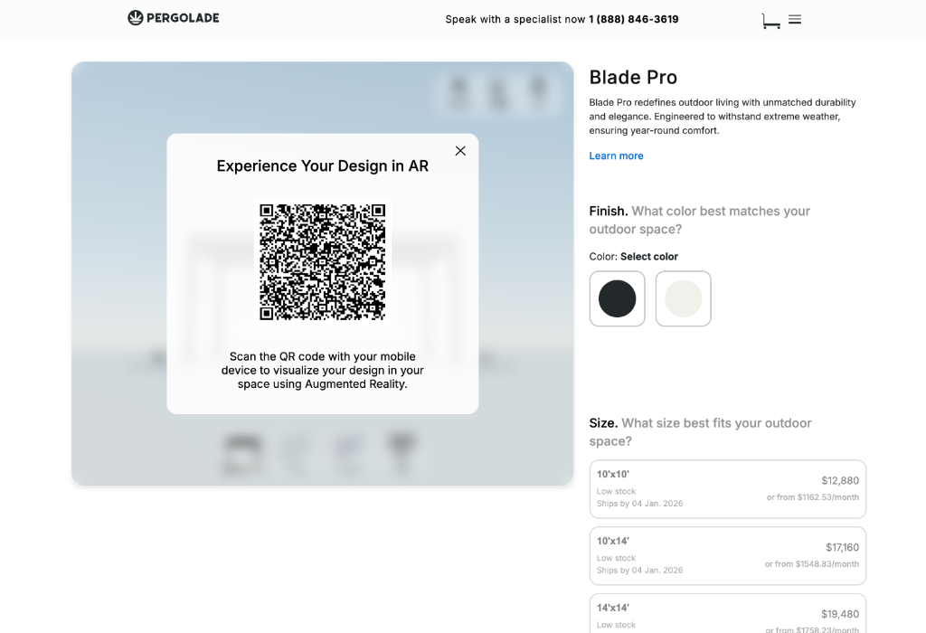
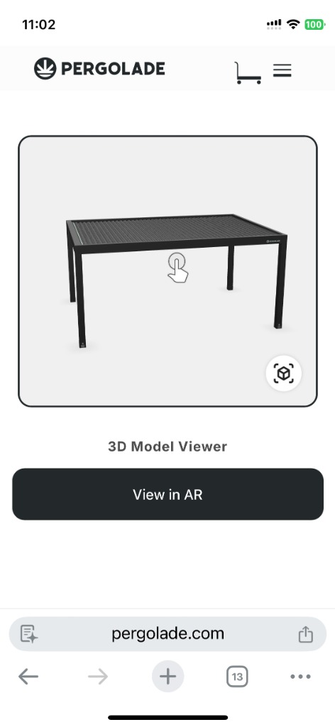
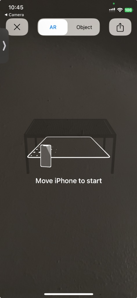
Bringing Designs to Life: AR Experience
To bridge the gap between digital configuration and physical reality, we implemented an Augmented Reality feature. Users can seamlessly transition from designing on desktop to visualizing their custom pergola in their actual backyard.
- Seamless Handoff: A dynamic QR code carries the exact configuration to mobile
- Real-Time Visualization: View size, colors, and shadows in the real environment

Content + UI decisions that made it feel premium
- More breathing room and fewer competing elements per section
- Stronger hierarchy: headings that orient, subtext that explains, UI that guides
- Benefit-first microcopy to keep language buyer-friendly (not spec-heavy)
- Repeatable components so the system can scale across future products
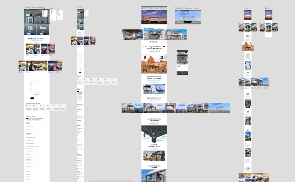
Iterations
Before landing on the final direction, I explored multiple visual treatments to balance:
- Architectural precision (clean structure, confident hierarchy)
- Lifestyle warmth (aspirational visuals that match the premium product)
These explorations helped us converge on a layout that communicates value fast and supports decision-making.
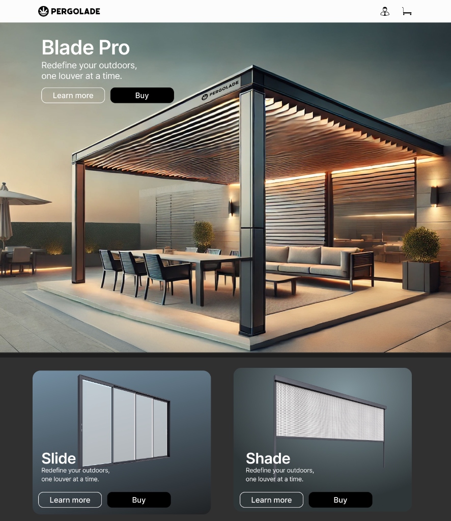
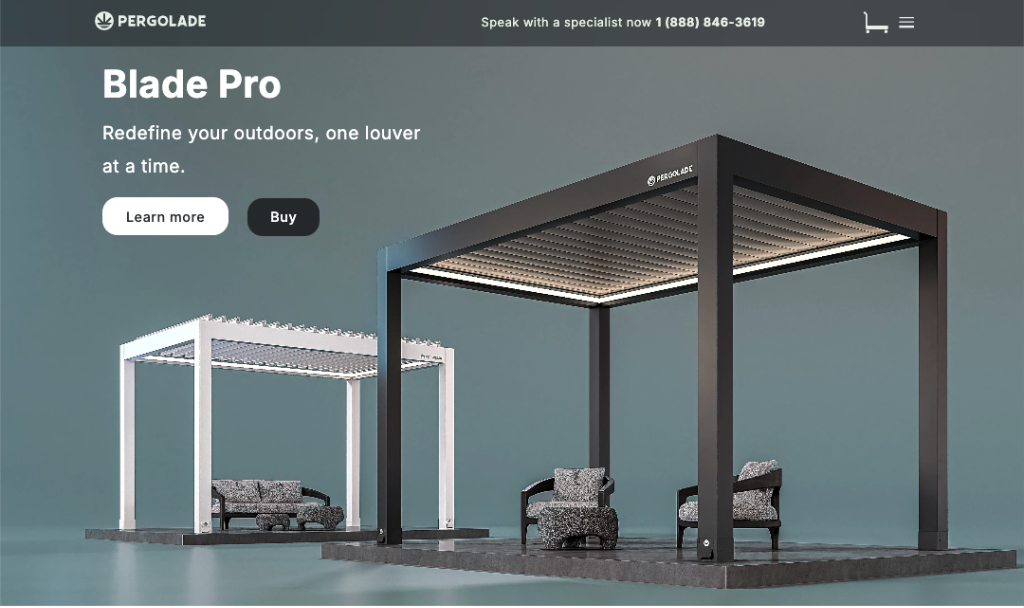
Final Design Highlight
A focused view of how the product presentation supports configuration decisions.
Collaboration + delivery
This project was highly collaborative with the owner, so I structured work around fast alignment and clean handoffs:
- Weekly working sessions to confirm priorities and messaging
- Design iterations paired with feasibility checks from the developer
- Component specs + behavior notes for implementation
- Responsive rules to ensure consistent UX across breakpoints
Outcome (qualitative)
- A more premium-feeling page structure that guides users through decisions
- Clearer configuration steps that reduce "guessing" and improve confidence
- A responsive configurator layout that maintains clarity on mobile
- A scalable section + component system that can be reused for future products
What I'd do next
If I extended the project:
- Run lightweight validation (5–8 sessions) focused on comprehension + decision points
- Instrument key events (step completion, drop-off, add-to-cart intent)
- Iterate based on behavior data plus support/sales feedback