Summary
Designed the core field experience — identify, log, and review — with one-hand layouts, large targets, and a calm visual language that doesn't compete with the bird.
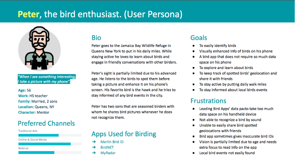
The problem
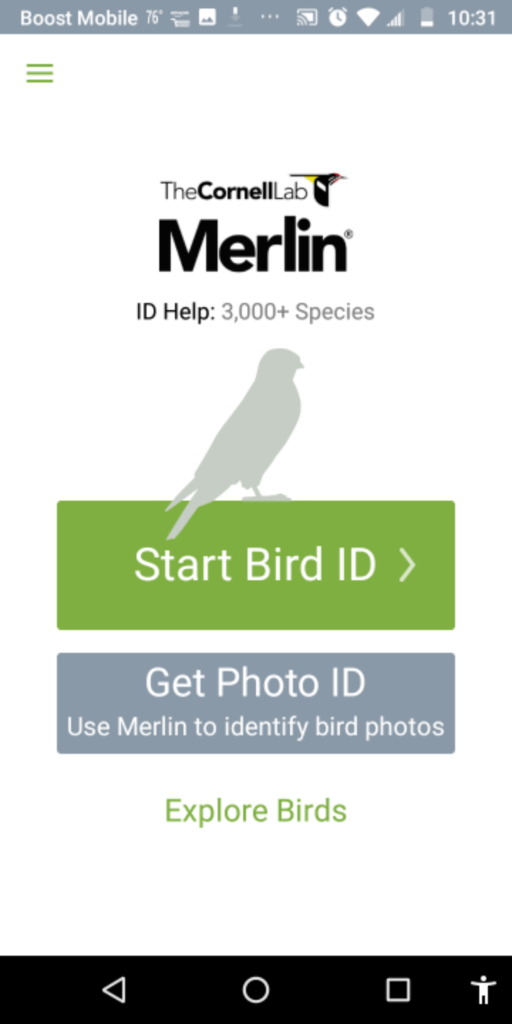
Birders rely on a patchwork of apps, printed guides, and each other. Existing tools are crowded, demand two hands, miss IDs without signal, and pull attention away from the bird in front of you.
The challenge
- Identify a bird by sound, photo, or description — even offline.
- Work one-handed, in bright sun, for an audience that skews older.
- Stay calm and legible without competing with the subject.
- Earn trust against incumbents (Merlin, Audubon, GoBird).
My role
End-to-end UX: guerrilla research at Jamaica Wildlife Refuge and Central Park, competitive heuristic audit, IA, red routes, wireflows, hi-fi visuals, and a clickable prototype tested with seasoned birders.
Design decisions
One-handed by default
Shadowing showed birders thumbing the phone with one hand while the other holds binoculars. Primary actions live in the bottom third within thumb reach; the upper canvas stays for the bird.
Three ways to identify
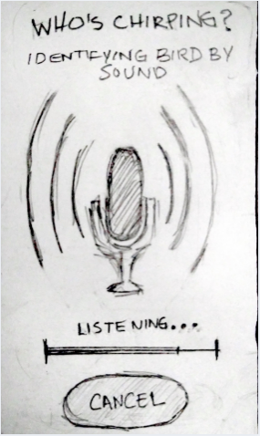
Sound, photo, and description each get their own red route. Whichever sense the birder used first is the fastest path to a shortlist — no nested menus, no mode switching.
Low-light, high-contrast palette
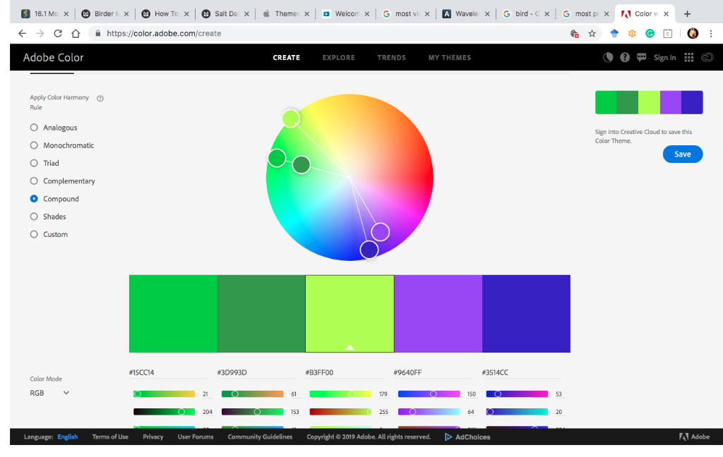
Color theory research drove a deep green and warm amber system tuned for dawn, dusk, and direct sunlight — the times birders are actually out.
System
Red routes
Four critical journeys — identify by sound, photo, description, and search by name — mapped end-to-end so every screen earns its place.
Type & color
Roboto for UI, Oswald for headers. A muted green canvas with amber accents keeps focus on imagery and survives bright outdoor light.
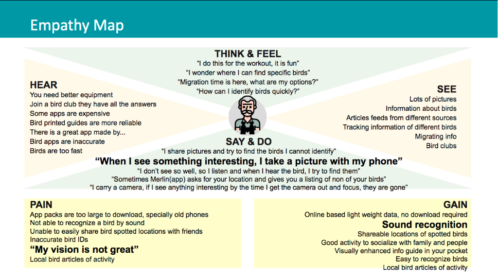
Empathy-first IA
Persona Peter, 52, drove decisions on copy size, tap targets, and onboarding — which we ultimately removed after testing.
Interface
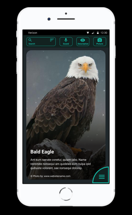
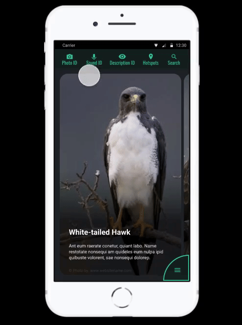
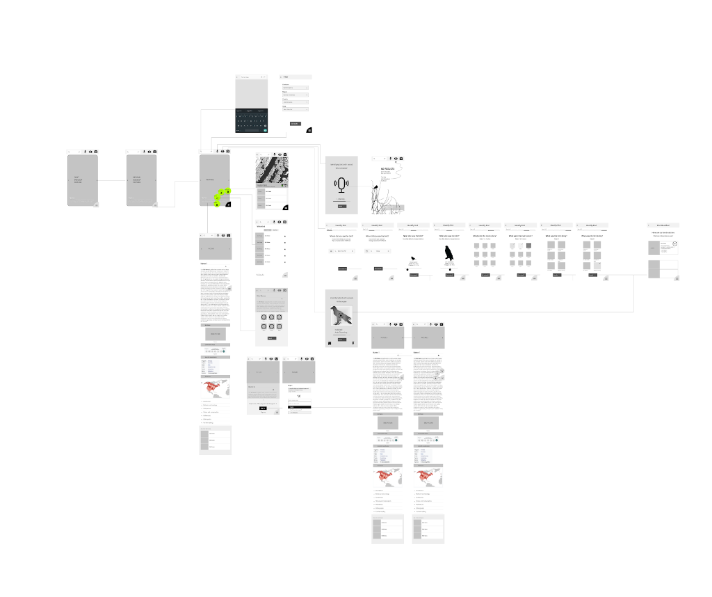
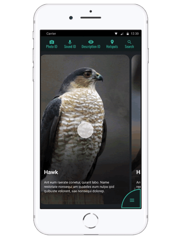
Identify — single subject, single action
One large image, a black frame, and one primary action. The shutter, mic, and description entry sit where the thumb already is.
Result — confidence first
Top match leads with image and common name; alternates collapse below. Notes, location, and time auto-attach so logging happens by default.
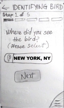
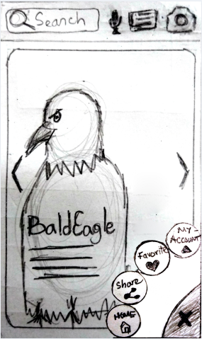
Sketch to ship
Low-fi paper sketches resolved layout questions in minutes — what survived to hi-fi was already validated against the one-hand constraint.
Persona & empathy
Peter, a 52-year-old weekend birder, kept the team honest: bigger type, fewer modes, no jargon, and an exit from every screen.
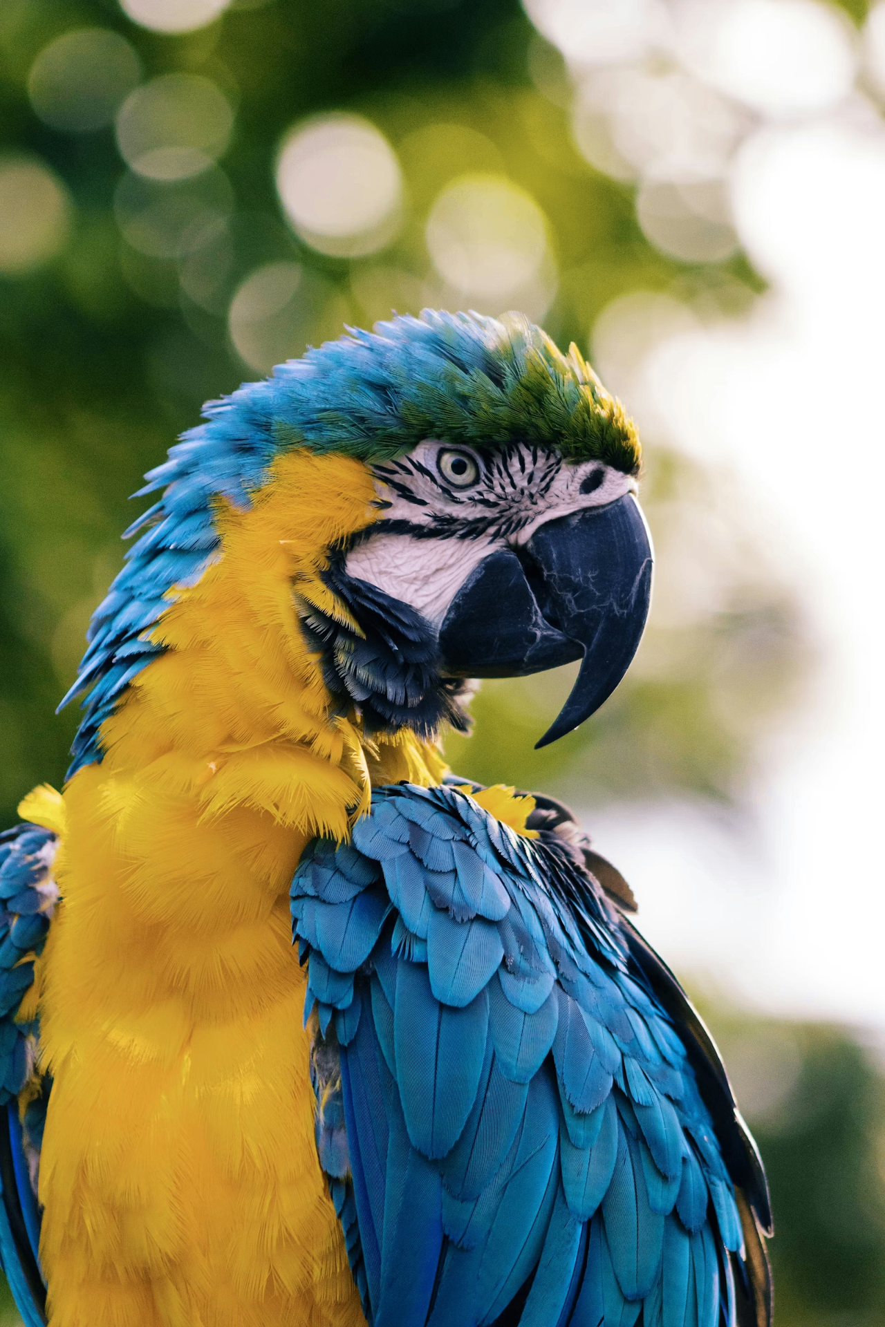
Gallery
Outcome
A field-ready prototype validated with seasoned birders: faster ID paths, fewer taps to log, and a visual language that gets out of the way. Onboarding was removed after testing showed users skipped it entirely — the app teaches itself through use.
Reflection
Birder taught me how much UX lives outside the screen. The biggest wins came from watching how people hold a phone with binoculars in the other hand, not from any framework. It's also the project that convinced me to design for the moment a tool is actually used — not the moment it's demoed.