Modernizing the Life Insurance Quote Engine
Redesigning a legacy quote engine to improve conversion rates and user trust through progressive disclosure.
8 weeks
2w discovery + 4w design + 2w iteration
Me (Lead UX)
Senior UX Architect, UX Director, 2 FE Developers
CRO, IA Redesign, Canopy Design System Integration, Mobile-First Strategy
The Challenge: A High-Friction Gateway
Legal & General's legacy quote engine was a single-page form that acted as a significant barrier to lead generation. The experience was clinical, overwhelming users with over 10 dense input fields immediately upon landing.
Information Overload
Desktop users were forced to provide sensitive health data without established trust.
Technical Failure on Mobile
On tablets and smartphones, the system keyboard routinely obscured input fields and the CTA.
Cognitive Load
The "all-at-once" approach felt like an interrogation rather than a helpful service.
Discovery: Validating Friction with Data
I conducted a deep-dive audit using Google Analytics to move beyond subjective design opinions and pinpoint exactly where the funnel was leaking.
What the Data Revealed
- The Mobile Gap: significant drop-off in conversion rates on mobile vs desktop.
- Input Bottlenecks: high exit rates at "Weight" and "Nicotine Use".
- Device Inconsistency: fragmented navigation confused returning users.
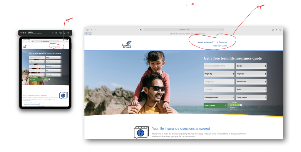
Before: Cluttered single-page form with keyboard issues

Mobile: Analyzing the cluttered form on Android vs iPhone
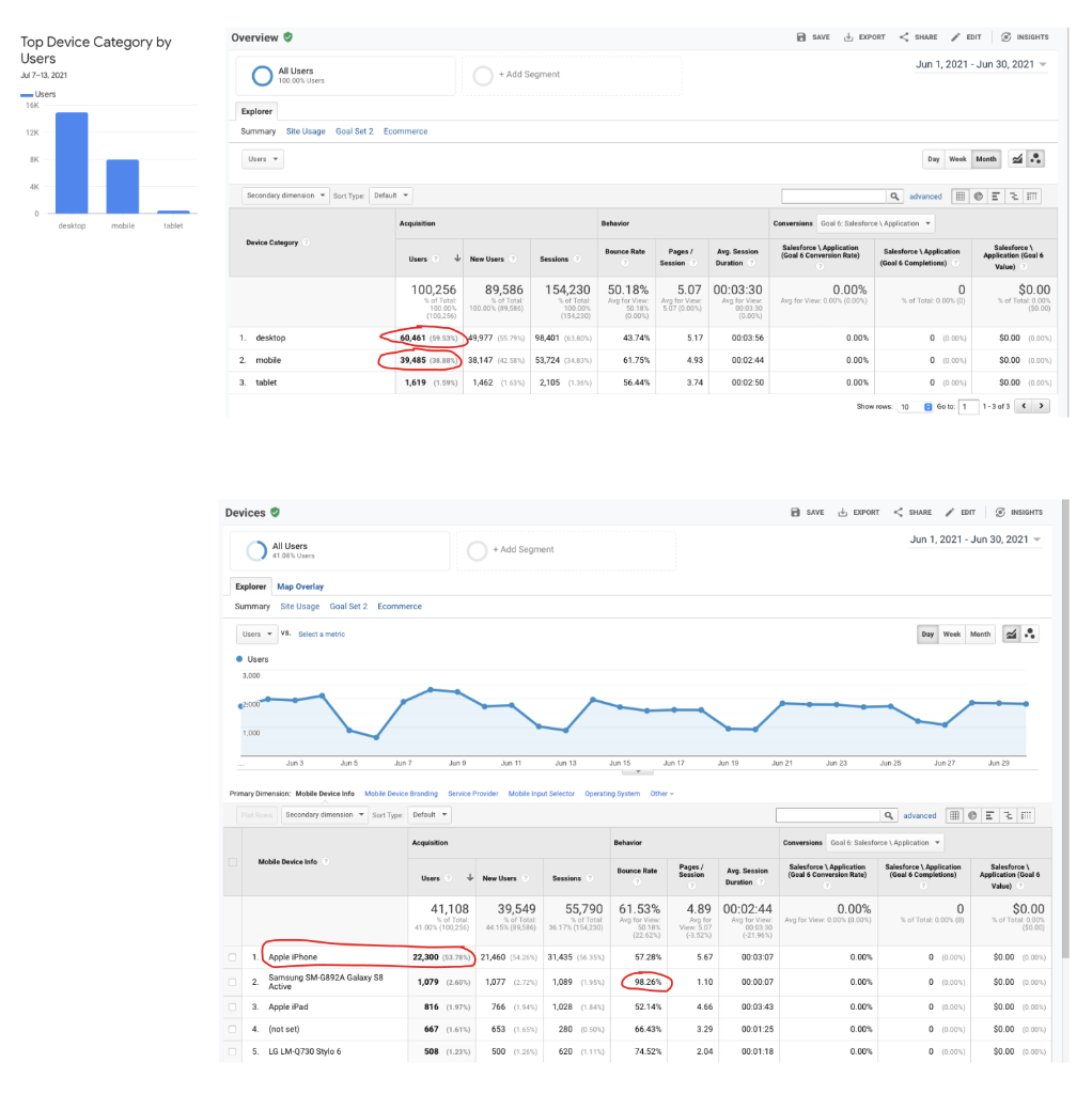
Data: 98% bounce rate on specific Android devices revealing the technical barrier
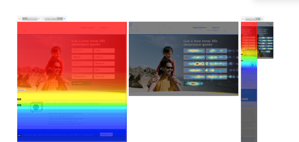
Heatmap: Users struggled with field navigation
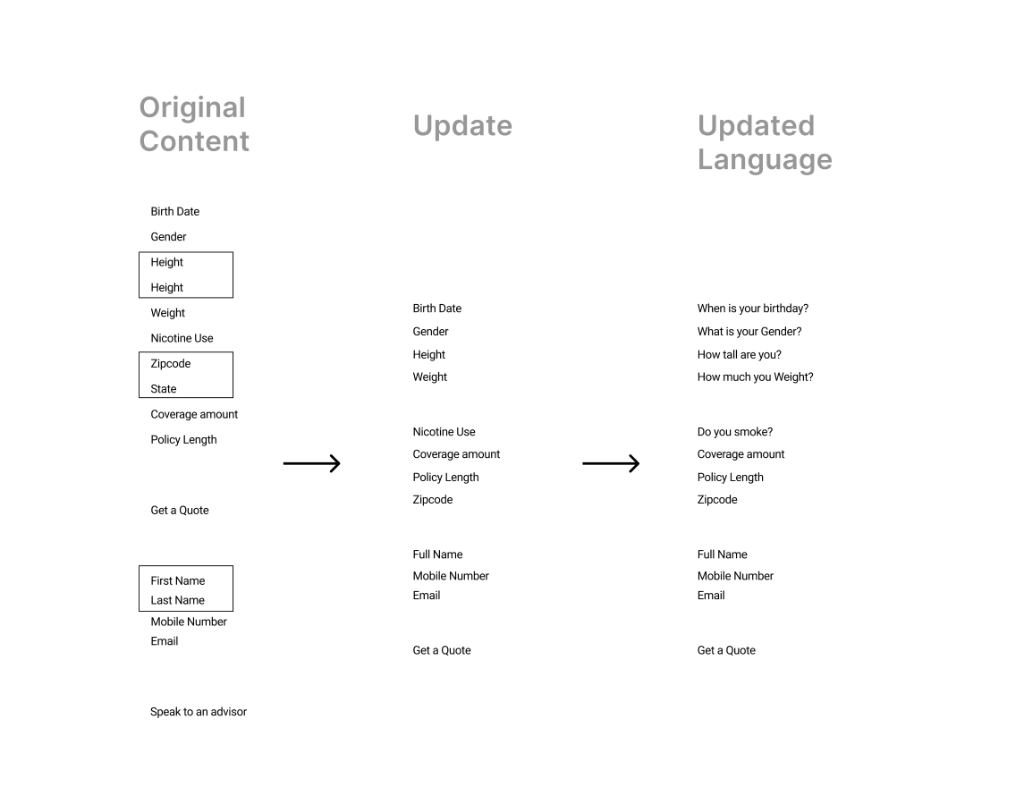
Strategy: From Data Entry to Conversation
To solve these friction points, I reimagined the information architecture (IA) by shifting to a progressive disclosure model.
Conversational Language
"Birth Date" → "When is your birthday?"
Logical Staging
Health Info → Strategy → Quote Results → Contact
The "Value Exchange"
Provide quote estimate before lead collection to build trust.
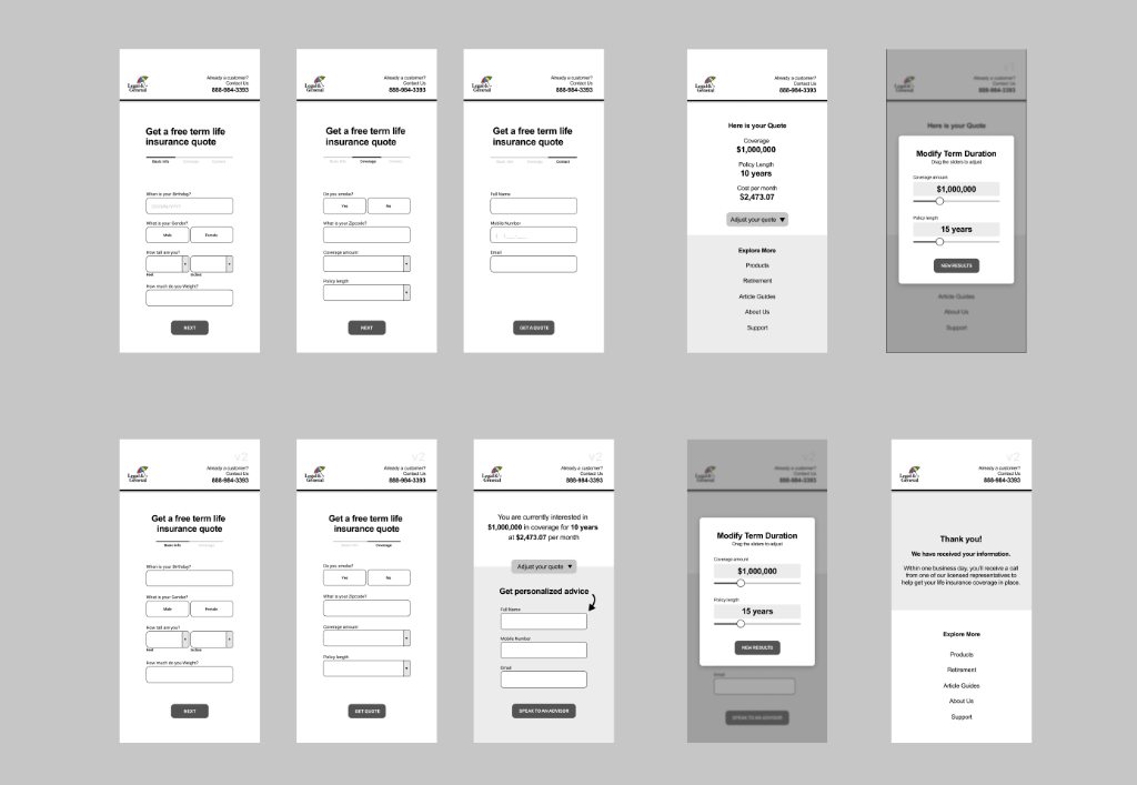
Early Sketches & Iterations
Initial paper prototypes exploring field grouping and flow.
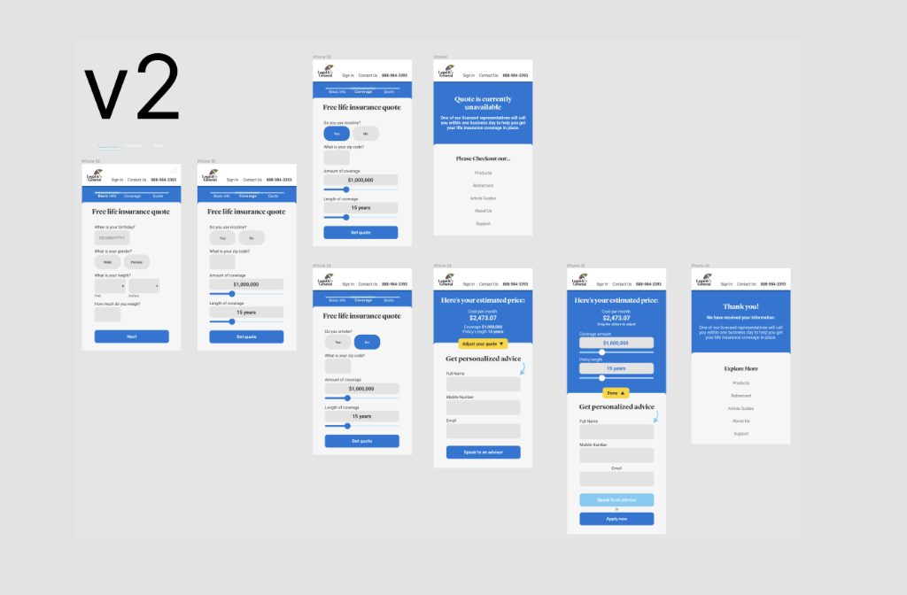
The Evolution of the Information Architecture
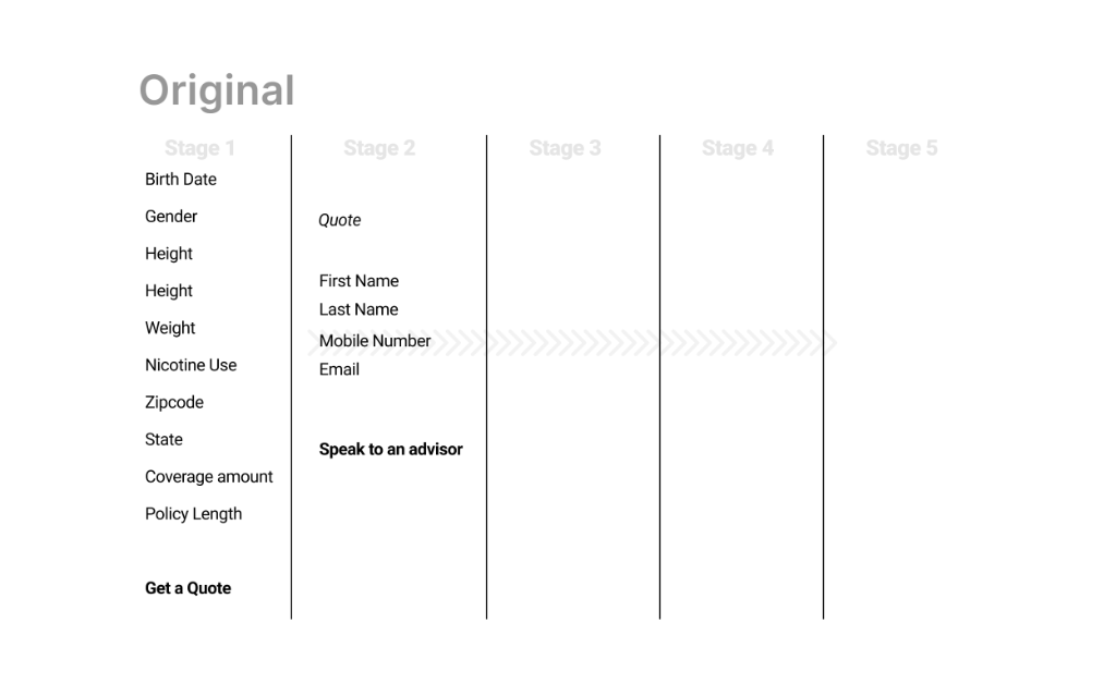
Original Structure
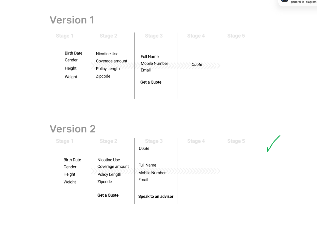
Iterations 1 & 2
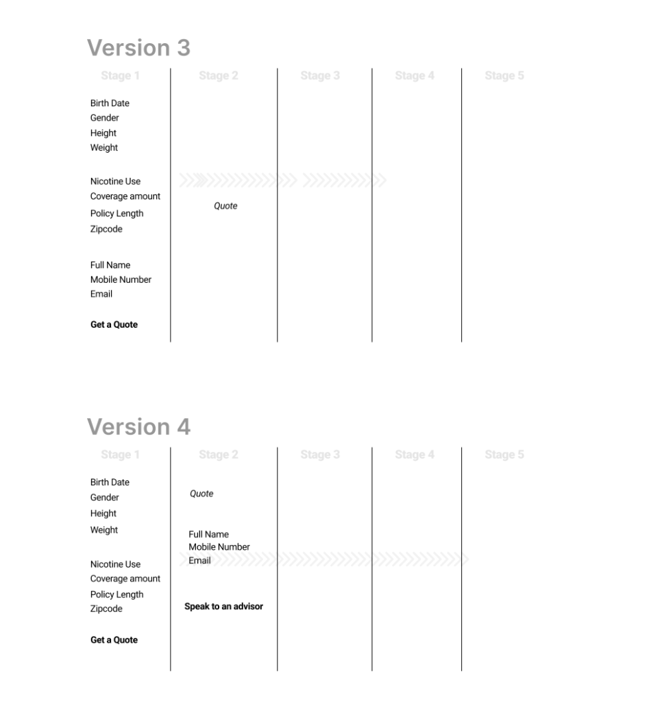
Iterations 3 & 4
Final Flow
We iterated through 5 major versions of the flow to find the perfect balance of granularity and speed.
Key Design Decisions & Tradeoffs
Progressive Disclosure vs. One-Page
The Tradeoff
One-page is fast, but mobile users were abandoning due to overwhelm.
The Result
Four stages created momentum. "Small commitments" rather than a daunting task.
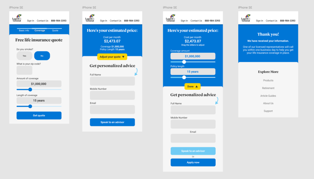
Sliders vs. Text Inputs
The Tradeoff
Sliders are engaging but less precise. We allowed manual overrides.
The Result
Users reported sliders felt "easier and more natural." No increase in data errors.
Showing Quotes Before Lead Capture
The Tradeoff
Sales worried about volume. I argued for quality.
The Resolution
Client accepted based on competitive benchmarking and promise of qualified leads.
Design System & Brand Integration
I ensured the solution was technically scalable and brand-aligned by strictly adhering to the Canopy design language (Legal & General's design system).
System Thinking
- Component Compliance: Mapped to Canopy's coding base for seamless handoff.
- Visual Trust: Leveraged core brand palette (L&G Blue) for stability.
- Touch-Optimized: Target sizes increased from 32px to 48px minimum.
From Wireframes to High-Fidelity Canopy Components
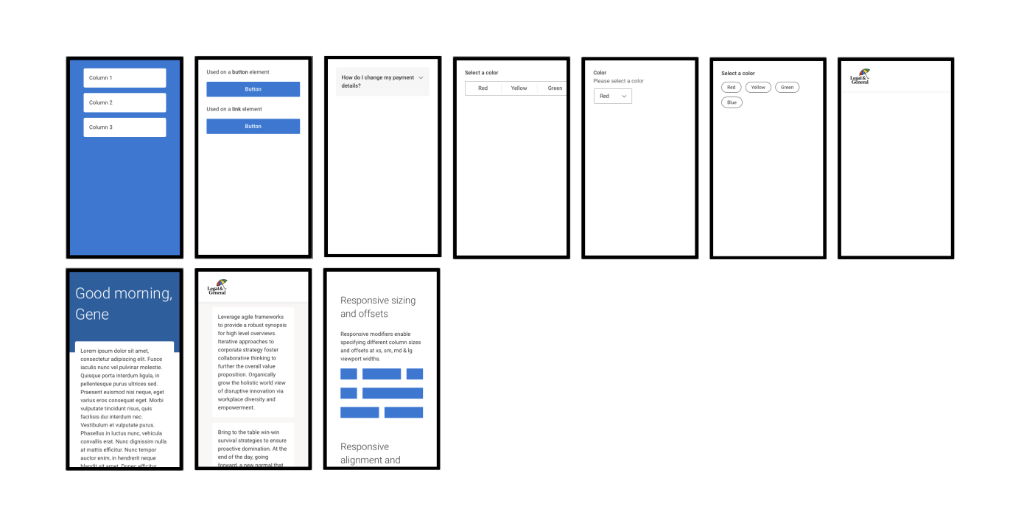
Canopy Design System: Standardizing components for consistency
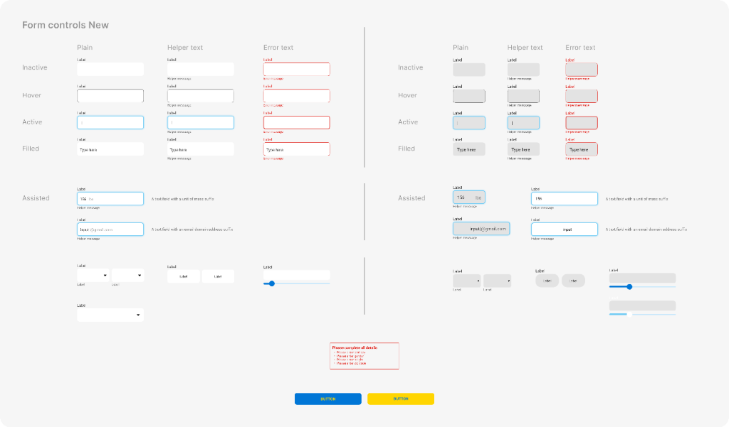
Updated Form Controls: Defining interaction states for accessibility and clarity.
Iterative Prototyping & Collaboration
We developed two distinct prototyping directions. After stakeholder review and internal testing, we moved forward with v2 (interactive-driven) as it better balanced efficiency with user confidence.
Hi-Fi progression generating a clickable prototype
Stakeholder Management
Weekly reviews with UX Director to ensure strategic alignment.
Peer Review
Collaborated with Senior UX Architect to pressure-test interaction models.
Version Testing
Validated "interactive" vs "focus-driven" approaches.
Design Principles That Guided This Work
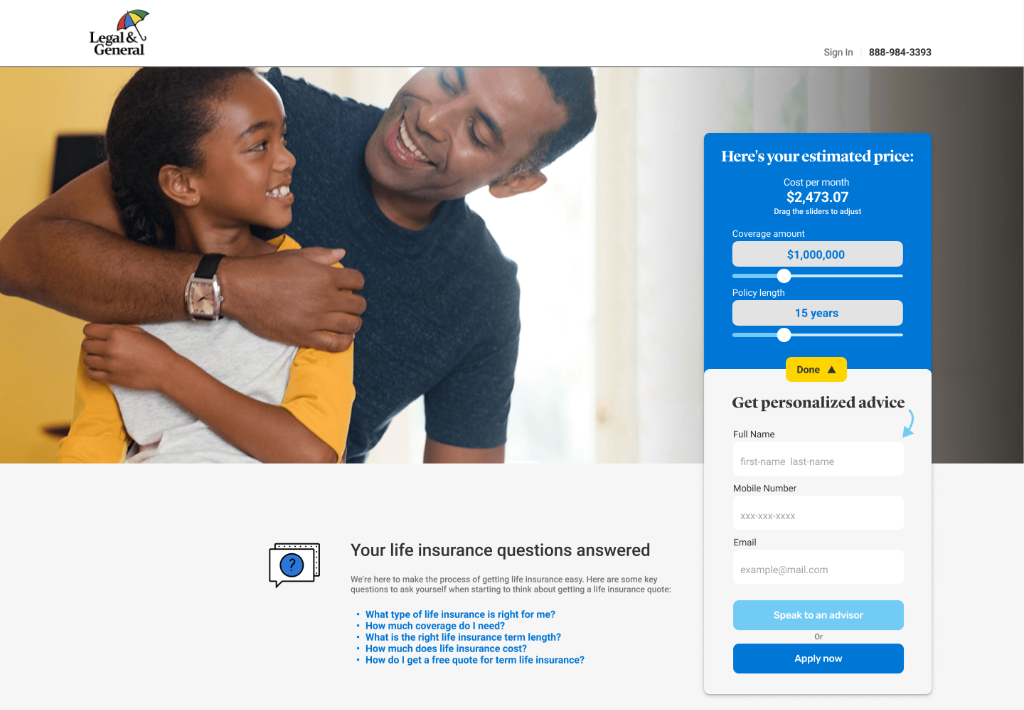
The Final Solution
The redesigned quote engine transformed a daunting administrative task into a streamlined, guided journey that respected users' time and built trust through transparency.
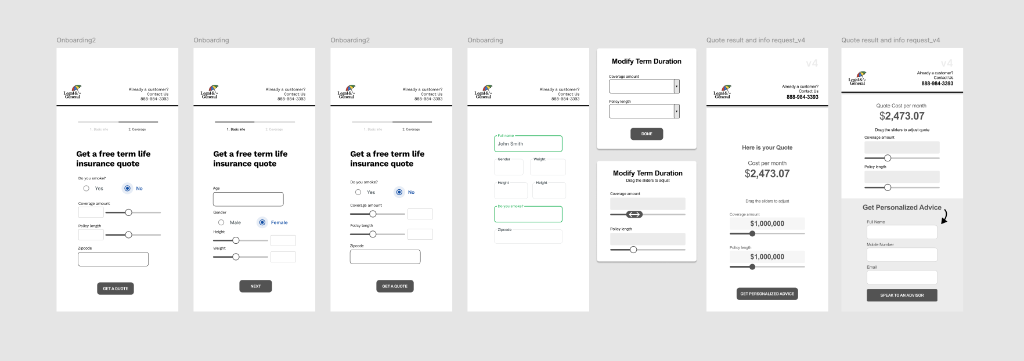
- Four-Stage Progressive Flow: Health Info → Strategy → Quote Results → Contact
- Conversational UI: Natural language questions that feel human.
- Touch-Optimized Controls: Sliders and toggle cards for mobile.
- Value-First Approach: Show quote estimates before requesting contact info.
- Responsive Design: Seamless from mobile (320px) to desktop.
- Canopy-Compliant: Full design system integration.
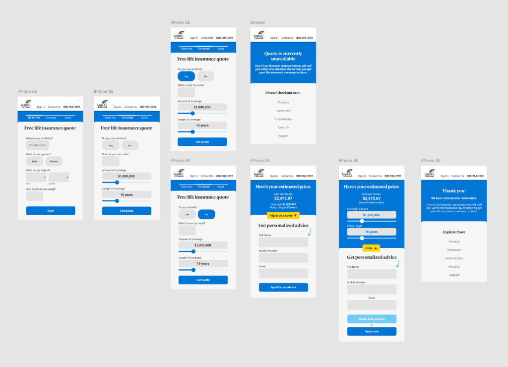
Mobile Progressive Disclosure Flow
Solving the viewport issue: The "Next" CTA is now permanently visible above the keyboard.
Outcome: Validated Through Longevity
Post-launch conversion data remained confidential due to client NDA, but the client's decision to keep the redesign live for over a year in a regulated, high-stakes environment speaks to its effectiveness.
What We Achieved
- Eliminated mobile keyboard overlap (100% visibility)
- Reduced cognitive load (10+ fields → 4 stages)
- Increased user confidence via upfront quotes
- Enterprise adoption of Canopy components
Process Impact
- Increased touch target sizes (32px → 48px)
- Mapped to Canopy design system
- Zero rollback requests in 12+ months
Reflection
What I'd Do Differently
- Instrument Analytics Earlier: Set up event tracking for each stage to validate drop-off.
- Test Alternative Key Formats: A/B test comparison table vs card-based results.
- Explore Voice UI: For users uncomfortable typing health data on small screens.
What This Taught Me
- The importance of negotiating metric access in the SOW.
- How to balance brand compliance with innovation.
- Sometimes the best design is the one that gets out of the user's way.