Birder
A Passion Project
UX Designer
7 months
Pen and paper, Miro, Sheets, Docs, Figma
Intro
Birdwatching is one of America’s biggest pastimes, it involves the use of one senses to identify birds by sight or sound. New York City offers some of the best places in the world for bird watching; nonetheless, birds migrate throughout the whole year all around the world; for that reason, there are unlimited best places to watch birds everywhere.
The Problem
Bird enthusiasts often rely on various tools to recognize and find information about birds, which include digital apps, printed guides, and other birders. Very few apps on the market do a fair job recognizing a bird, and they often fall short offering the functionality, reliability, and ease of use that most users are looking for; therefore, seasoned birders often go back to rely on printed guides and switching between a handful of apps out of frustration.
The Solution (Goal)
With the use of new technological implementations, user research, interviews, surveys and in-depth analysis of leading apps' strengths and weaknesses, Birder plans to provide an effective alternative solution. The purpose of the Birder app is to effectively identify any bird around the world while keeping the user engaged into exploring more about birds in one app while providing a seamless human–computer interaction.
Process
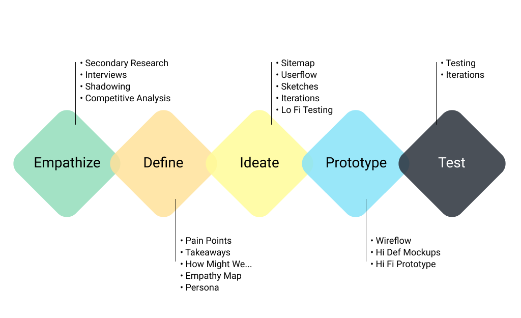
Research Methodologies
- Primary and Secondary Research: Screener surveys were placed online to identify potential phone interviewees.
- Guerrilla Research: Conducted at The Jamaica Wildlife Refuge and Central Park Bird Sanctuary to enlist and interview seasoned bird watchers on the spot.
- Social Recruitment: Platforms like Instagram were used to reach target users with extensive birdwatching experience.
- Interviews & Testing: Sessions lasted 30-60 mins, including briefings, interviews, and task performance on existing apps (e.g., demonstrating how they identify a bird).
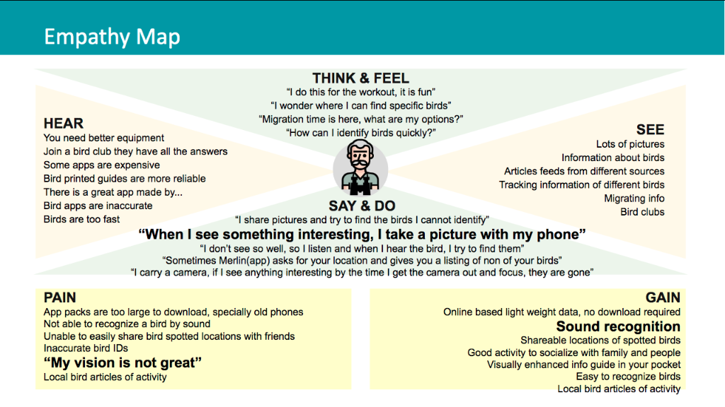
“Sometimes Merlin(app) asks for your location and gives you a listing of none of your birds”
Secondary Research
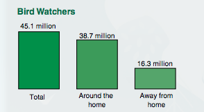
I ran secondary research on various sources which included the U.S. Government Census of Wildlife surveys and major U.S. and European bird associations to find out how many birdwatchers are out there and what are some their behaviors.
U.S. Department of the Interior FISH AND WILDLIFE SERVICE. Issued January 2018
Shadowing
Observing users on their natural environment. On this phase, I observed bird watchers interact with their phones while using a bird app on their natural environment setting. A notable trait on these users was a peculiar use of holding the phone with one hand while using the other hand's index finger to navigate the phone.

Competitive Analysis
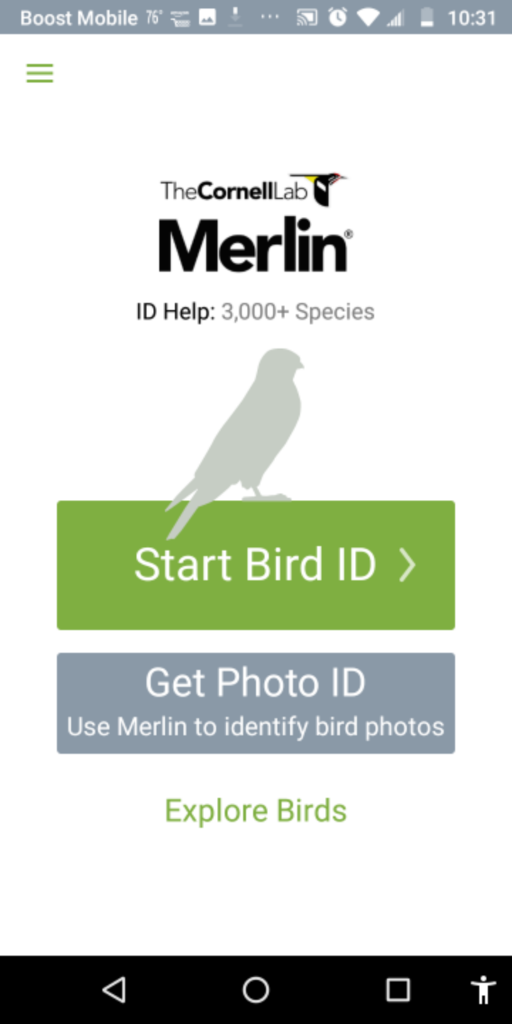
To learn from existing apps, I reviewed various bird apps and identified 3 competitors: Audubon, Merlin Bird ID, and GoBird. I evaluated them on the basis of three of the ten Nielsen Norman Usability Heuristic principles.
Match between system and real world
The system should speak the users’ language, following real world conventions.
Flexibility and efficiency of use
Accelerators should cater to both inexperienced and experienced users.
Recognition rather than recall
Minimize memory load by making objects, actions, and options visible.
MerlinScore: Great
Match between system and real world
Excellent simplified IA. Uses 5 simple questions to guide identification. Great for beginners.
Flexibility and efficiency of use
Straightforward but lacks sorting by name. Copy is too small for the older target audience.
Recognition rather than recall
Does a great job guiding the user through a journey to recognition.
AudubonScore: Poor

Match between system and real world
Overabundance of information. Poor IA distribution. Search function lacks basic filters.
Flexibility and efficiency of use
Bird ID feature is good but feels like an external integration. Navigation is too deep.
Recognition rather than recall
Good job pairing images with names, but search fails to recall similar words.
GoBirdScore: Average

Match between system and real world
Simple, basic language. Links to Wikipedia for descriptions.
Flexibility and efficiency of use
Limited features. Relies on location matching. Lacks search or ID tools.
Recognition rather than recall
Straightforward list of images. Easy to recognize.
Discovery
Key Takeaways
- 45.1 million enthusiast bird watchers in the USA
- Average age is 50 yrs old (can benefit from visual enhancement)
- Most apps require large data downloads
- Average user owns old phones with limited storage
- Many reported inaccurate bird IDs
- Users use "birding" to stay active and socialize
- Sound identification is a prominent feature request
- Users mostly use two hands to operate phone
Formulating a Solution
On the first phase I concentrated on creating a Minimum Viable Product (MVP) in order to deliver enough features to meet the needs of early customers. This strategy provides feedback for future product development.
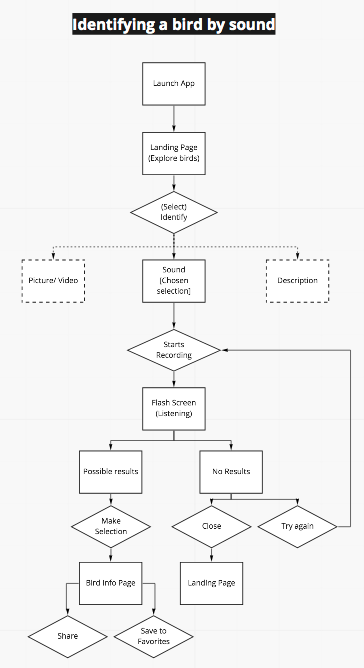
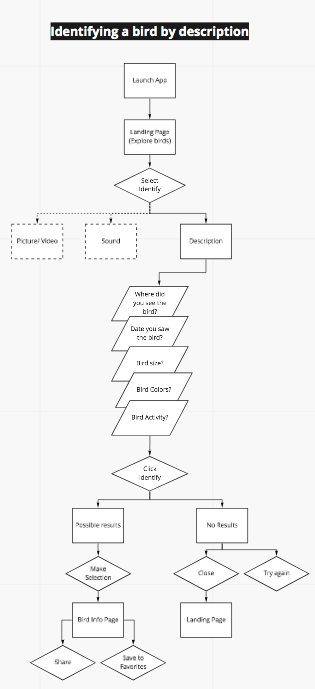
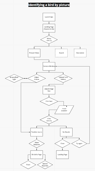
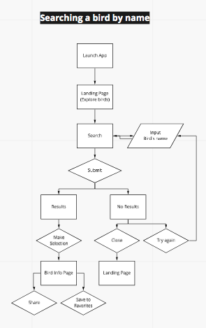
Redroutes (Critical User Journeys)
By creating red routes I can visualize the critical tasks that deliver the most value to the users, they are fundamental user journeys that make the product valuable.
View Marvel PrototypeDiagram Key:
Empathy Map
I created an Empathy Map based on all the interviews and observations to visualize the users' attitudes and behaviors. What they say, think, do, and feel is a critical component to create a great user experience.
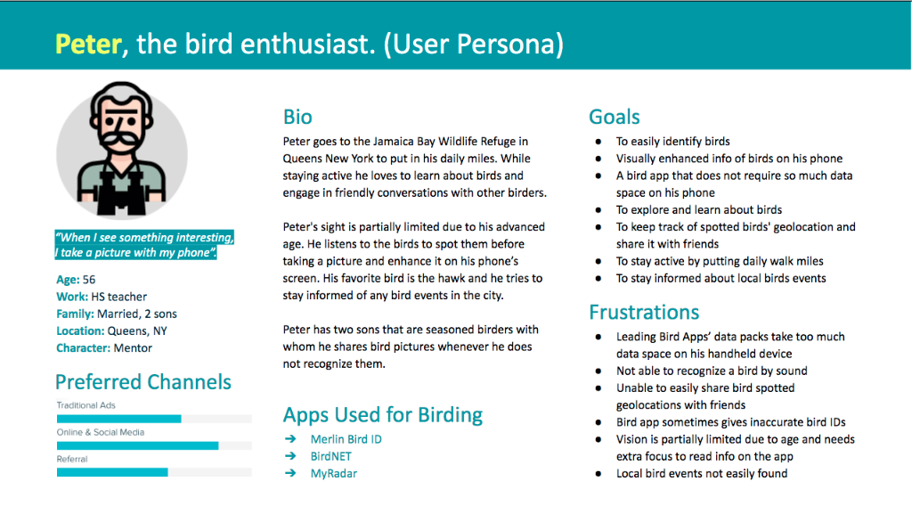
User Persona: Peter
After synthesizing the interviews and observations, I created one user persona that matched the category of the targeted user according to research surveys.
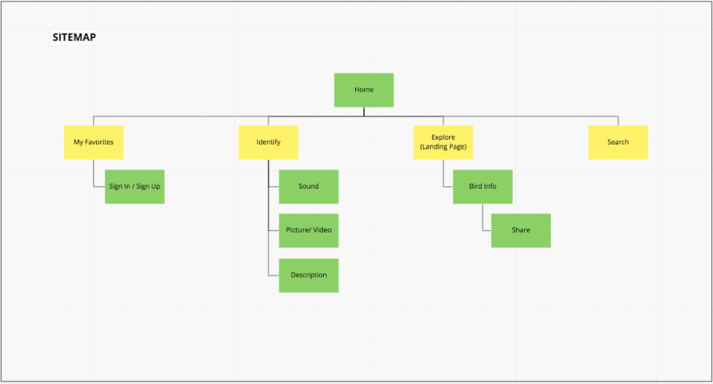
Sitemap
I created a sitemap to organize the content and navigation structure, ensuring a logical flow for the user experience.
Design Phase
Prototypes & Refinement
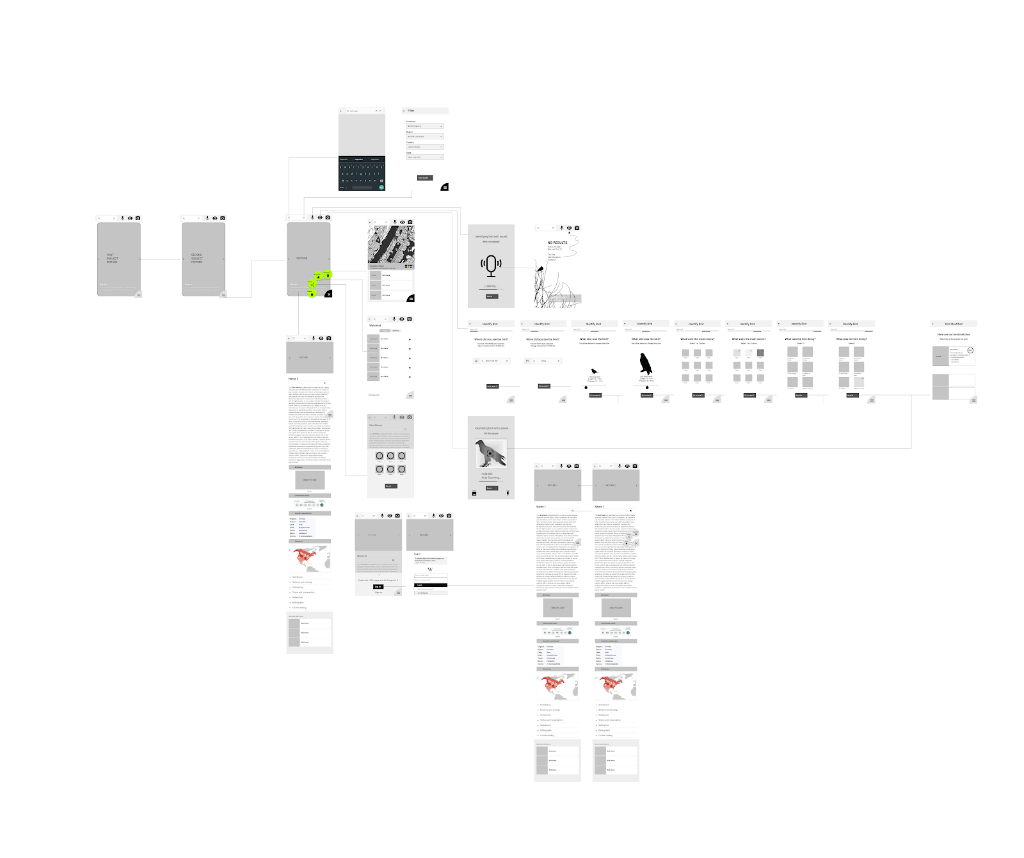
I started with low-fidelity sketches to iterate quickly, then moved to wireflows to visualize complex user workflows.
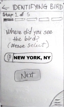
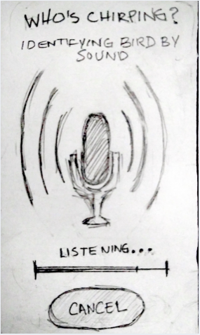
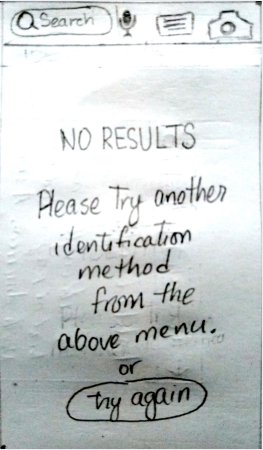
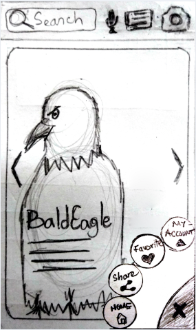
Wireflow
Styling & Visual Design
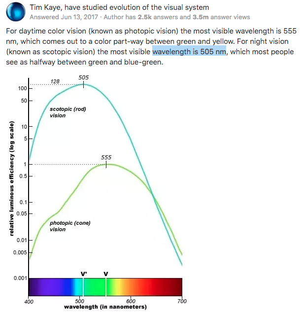
For Styling, I focused on legibility and optimal viewing conditions for birding.
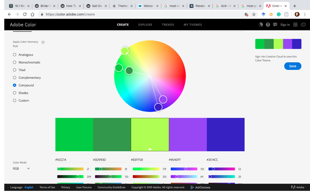
Color Theory Research
App Color Palette
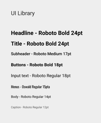
Typography System
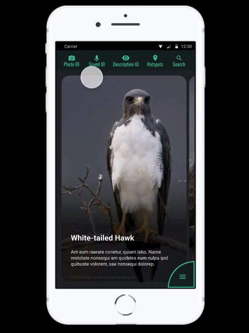
HiFi Mockups
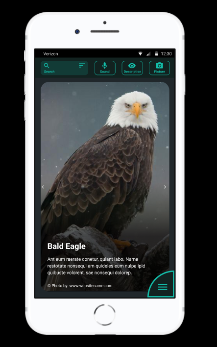
Menu styling and button positioning are based on the shadowing study for optimal photography previewing and easy clickable access. The landing/exploring page displays one single large image at the time with a black frame around it to showcase the subject at hand.
Interaction Prototype
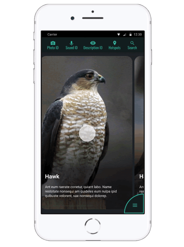
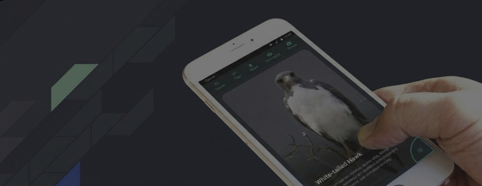
Demonstrating the "One-Handed Navigation" concept in action.
Testing & Iterations
- Most users ignored onboarding screens; therefore, onboarding screens were taken out and the design was simplified.
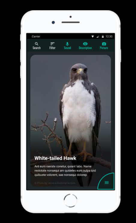
- Several menu components were integrated into the visible menu instead of hiding it in the sub-menu. The user responded better to this strategy.
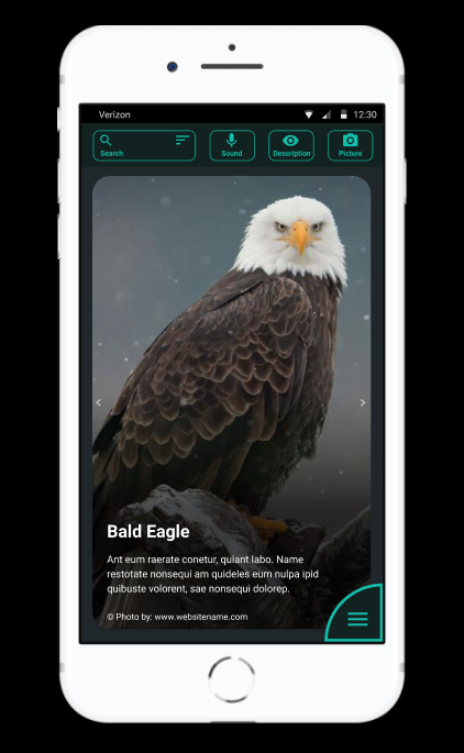
Original Menu Interaction

Refined Menu Interaction
Learnings
Working on this project gave me the opportunity to learn so much about UX research, I had the chance to try out many different methodologies and incorporate new tools. I also learnt a lot about birds and it was a pretty fun, challenging and rewarding adventure. I also got to experience seeing from the eyes of many different levels of birders.
Next Steps
Next Project
Modernizing the Life Insurance Quote Engine